Your home’s atmosphere goes far beyond furniture arrangement—the colors surrounding you actively shape how you feel and think within that space. Scientists have proven that color triggers measurable emotional and neurological responses, yet most of us decorate by instinct rather than intentional design.
Here’s what makes this powerful: when you pair colors strategically, you’re activating specific neural pathways that genuinely alter your mood, energy levels, and even stress responses. It’s not magic—it’s color science in action.
Warm colors (reds, yellows, oranges, and earth tones) stimulate and energize, while cool colors (blues, greens, purples, and most grays) calm and relax. But the real transformation happens when these warm and cool tones work together. A soft roseate pink with fresh green creates a cheerful yet grounded feeling—the warmth prevents it from feeling overly sweet while the green anchors you psychologically. Butter yellow paired with cool gray brightens naturally dark rooms without causing visual fatigue.
The secret lies in undertones. Soft pinks with cool undertones and light blues with green undertones consistently produce calming responses, while warm olives and rich reds deliver sophistication and emotional grounding when selected thoughtfully. Understanding these subtle variations means your color choices work harmoniously across different lighting conditions and room orientations—transforming color theory from abstract knowledge into practical, lasting design solutions.
Six Designer-Proven Color Combos That Actually Work
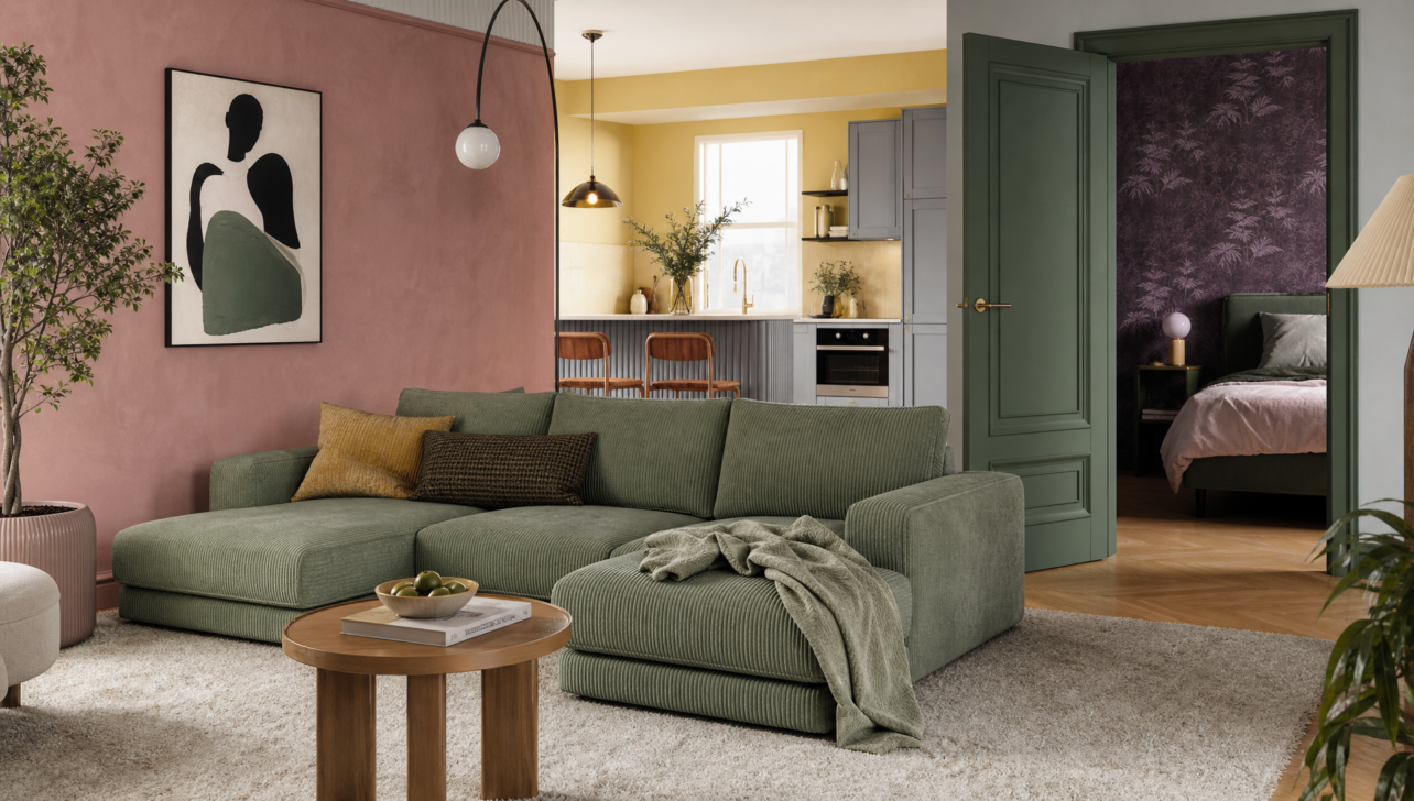
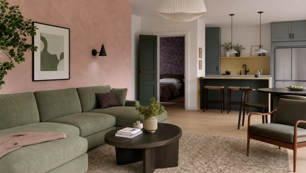
Plaster Pink + Sage Green: This pairing delivers cheerfulness with restraint. The cool undertones in quality greens balance the softness of rose-tinted pinks, preventing either from overwhelming the other. Use this as a full-room palette or anchor neutral spaces with accent walls.
Butter Yellow + Cool Gray or Soft Blue: Perfect for north-facing rooms struggling with natural light. The yellow’s warmth stimulates energy while gray’s neutrality keeps things from feeling chaotic. This combination performs especially well in kitchens and home offices.
Asparagus Green + Teal: Asparagus green straddles warm and cool undertones, making it surprisingly versatile. Teal complements without competing, creating a balanced, unexpected pairing that feels intentional rather than accidental.
Deep Forest Green + Purple Wallpaper: This nature-inspired combination creates immediate emotional uplift while maintaining sophistication. It’s bold but grounded—perfect for bedrooms or creative spaces.
Mandarin Orange + Lush Green: The warm orange against grounding green suggests movement and playfulness without restlessness. This works beautifully as accent walls in eating areas or children’s spaces.
Ocean Blue + Sandy Pink: This coastal-inspired pairing delivers visual balance that feels both invigorating and soothing—perfect for bathrooms or bedrooms. The cool blue against warm pink creates instant harmony.
The Emerging Trend: Herbal greens (sage, olive, eucalyptus) paired with warm whites and brass hardware create sophisticated, emotionally restorative spaces that feel both contemporary and timeless.
Neutral Doesn’t Mean Boring: Creating Layered, Personality-Filled Spaces
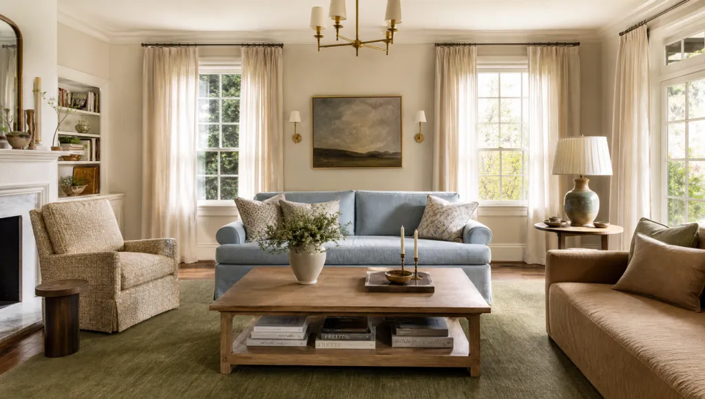
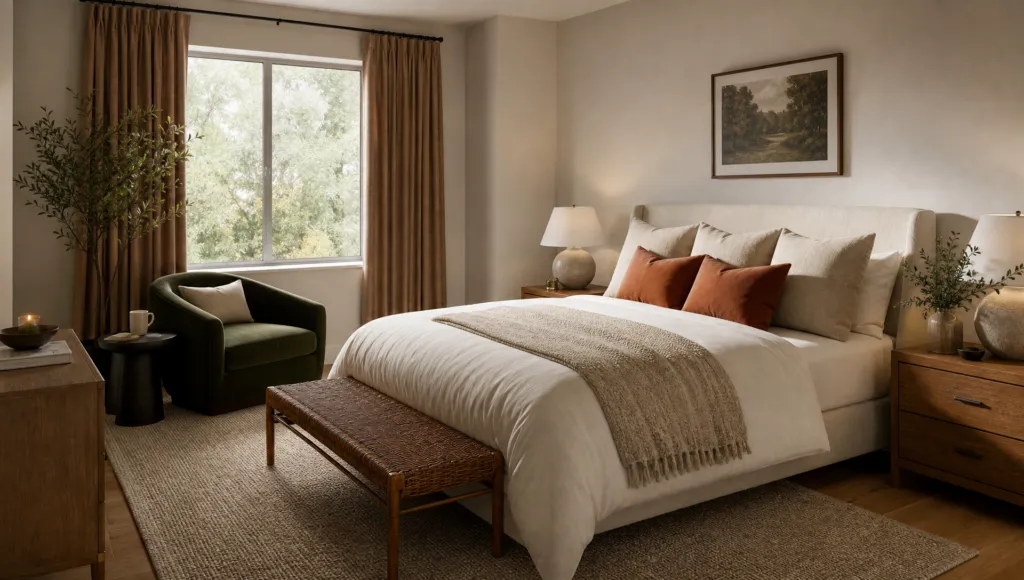
Forget stark white walls—contemporary design embraces layered neutrals that feel intentionally curated rather than blank. Think putty, warm white, oak tones, and textured surfaces that actually invite you into a room.
The key distinction separates thoughtful neutral schemes from lazy color avoidance. Successful neutral palettes require intentional color selection, textural variety, and strategic accent placement. Sand, terracotta, and moss green schemes prove that neutrals perform best when they tell a story. Chocolate brown with ochre, oaty white with dark brown, and olive green with fresh white all demonstrate how multiple neutral layers create dimension that single-color palettes cannot achieve.
Current design evolution favors pale beiges and greiges as foundational neutrals, layered with herbal greens, warm whites, and unexpected accent reveals. A pale beige foundation becomes sophisticated when paired with forest green and mustard. Light gray transforms when combined with terracotta warmth and plaster pink. Plaster pink layered with navy and green creates spaces that feel collected over time rather than designed all at once.
The Technical Magic: Simultaneous contrast—where colors viewed side by side alter each other’s appearance—means your neutral base tones dramatically shift how accent hues read in a room. Warm limewash alongside muted terracotta, or taupe with blush and mustard reveal that neutral design demands as much intentionality as bold color statements. Done right, these spaces age gracefully while maintaining emotional warmth.
The Design Shift Happening Now: Moving Beyond Moody to Meaningful
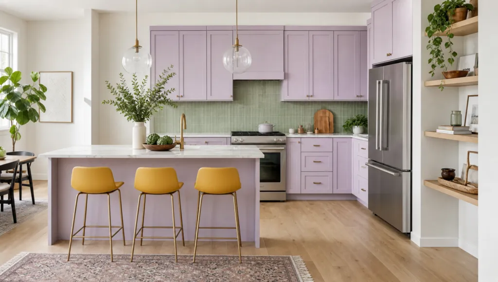
Deep, moody cabinetry in burgundy, navy, and emerald have peaked. The emerging aesthetic favors airier, fresher palettes that feel lighter and more inviting. Pale lilac, sunflower yellow, and bubblegum pink are challenging the dominance of forest and jewel tones.
This shift reflects something deeper: designers are increasingly recognizing that happiness-inducing colors create lasting satisfaction beyond momentary trends. Teal, herbal greens (sage, olive, eucalyptus), quiet pastels, and soft mocha tones are gaining prominence because they establish grounded, upscale atmospheres while maintaining the visual lightness modern spaces demand.
Why This Matters for Your Home: The strategic tweaks that prevent trending designs from becoming dated involve understanding color evolution rhythms rather than blindly following trends. Thoughtful color selection combined with textural changes keeps spaces feeling current. The shift from minimalism to pattern boldness, from maximalist excess to curated restraint, suggests that future-proof design balances personality with intentional restraint.
Practical Strategy: Designers increasingly recommend avoiding moody dark cabinetry in favor of lighter, more adaptable bases that accommodate evolving personal preferences. Flat walls are surrendering to textured surfaces, which fundamentally alters how color reads in rooms. A minimalist bedroom that felt serene now demands bolder patterns and visual depth. The pendulum will continue swinging—but intentional color choices ensure your space ages gracefully rather than feeling dated within seasons.
Making Color Choices That Stand the Test of Time
Here’s what separates spaces that feel timelessly beautiful from those that scream “that was trendy in 2023”: it’s not about avoiding trends—it’s about how colors are applied and maintained. A room painted in last decade’s shade can feel contemporary if color work combines thoughtfully with evolving textures and intentional design choices.
The Hidden Rhythm: Trends follow predictable patterns. Colors move from maximum saturation to softened tones, from flat surfaces to textural richness, from singular focus to layered complexity. Understanding these rhythms allows you to make color choices that feel current without requiring complete overhauls as preferences shift. The ongoing transition toward quiet pastels, calm greens, and warm neutrals reflects genuine shifts in how society values emotional well-being through design.
Context Changes Everything: A shade that feels perfect in store samples might clash with existing wood tones or overwhelm naturally lit spaces. That’s why undertones, surrounding materials, lighting conditions, and seasonal changes matter profoundly. Color harmony itself is influenced by temporal factors (changing trends), perceptual factors (how colors appear next to each other), and personal factors (your own preferences and experiences). This is why designer-recommended combinations and specific paint selections matter—they’ve been tested across real environments and proven durable beyond momentary trend cycles.
The Bottom Line: Homes that age beautifully combine color wisdom with complementary design elements—texture, pattern, material quality, and spatial arrangement. These intentional choices create environments that enhance well-being while remaining visually sophisticated across changing seasons and evolving personal preferences.