Sherwin-Williams, the world’s largest coatings company by revenue, just crowned a vegetable-inspired shade as its 2027 Color of the Year—and honestly, it’s worth paying attention to. This choice reflects far more than aesthetic preference. It signals a fundamental shift in what we want our homes to represent and how we want to feel in them.
The selection of Celery SW 6421 appears deliberate and calculated. Rather than chasing bold, trendy hues that dominate social media, Sherwin-Williams opted for something quieter yet more meaningful. This pattern reveals that color forecasting is driven increasingly by deeper consumer psychology and lifestyle priorities, not just visual drama. Research in color psychology shows that strategic color choices evoke distinct emotional responses and foster trust and familiarity—making subtle, nature-inspired shades like Celery powerful tools for creating emotionally resonant spaces.
What’s particularly striking is the industry-wide convergence. Multiple paint manufacturers are exploring nature-inspired palettes, indicating this isn’t an isolated experiment but a coordinated response to evolving consumer values. Soft, herbal greens like sage, olive, eucalyptus, and moss are gaining traction across design trends for 2026, all feeling calm and grounded. The real question: what cultural moment triggered this collective pivot toward botanical aesthetics?
Celery: The Color That Breaks All the Rules
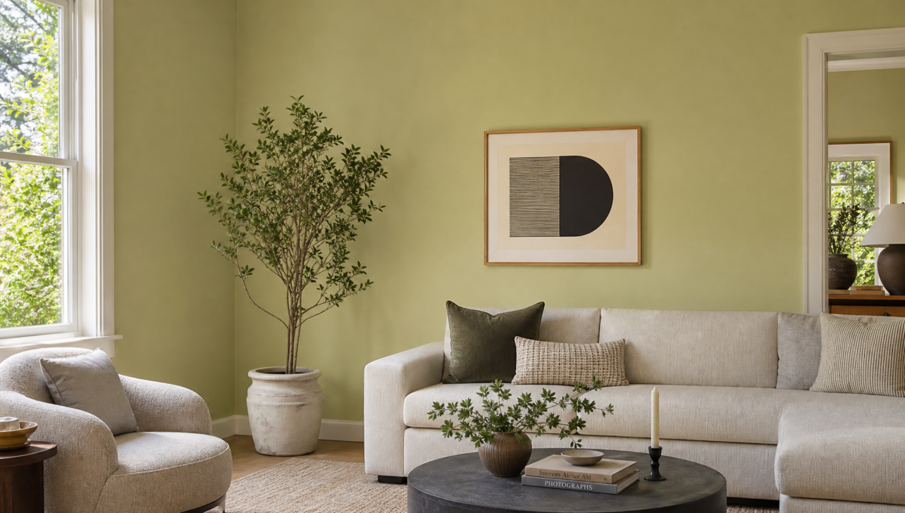
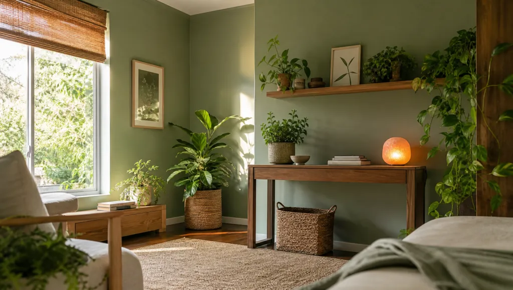
Celery SW 6421 defies what we typically expect from green paint. It’s a soft, muted yellow-green that somehow feels both contemporary and nostalgic, warm yet naturally grounded. The magic? Its yellow undertone prevents the clinical coolness that historically made green paints tricky in homes.
Designers noted how Celery’s warmth eliminates that sterile, institutional quality that can plague green rooms. This technical detail—those yellow undertones—transforms Celery from a simple nature reference into something genuinely sophisticated. It bridges modernist minimalism and organic design philosophy.
Sherwin-Williams positioned Celery as one of ten ‘Continuity Colors’ expected to maintain appeal across different rooms and evolving styles, suggesting it has unusual staying power beyond typical color cycles. This reflects the company’s deep expertise: they’ve developed over 35,000 color names throughout their history and maintain nearly 200 distinct shades of white alone, each classified as either warm or cool. That level of precision means Celery’s selection wasn’t random—it’s backed by decades of color science and consumer behavior research.
The Wellness Movement Is Redecorating Our Homes
Behind Celery’s selection lies something bigger: a sweeping consumer movement toward wellness, balance, and sustainability. Ashley Banbury, Sherwin-Williams’s color marketing manager, explicitly confirmed that Celery was chosen because it embodies contemporary values around psychological well-being and ecological consciousness. Modern color selection isn’t arbitrary—it responds to how people actually want to feel in their homes.
This reflects biophilic interior design principles, which deliberately incorporate natural elements, colors, and materials to foster well-being and strengthen our psychological connection to nature. Scientific research shows that soft, nature-inspired hues actively support mental health by tapping into our inherent affinity for natural environments.
Homeowners increasingly view their living spaces not just as shelter but as environments that actively contribute to mental health. Paint manufacturers, functioning as cultural observers, have recognized this shift and are responding with colors that facilitate those emotional experiences. This marks a departure from previous decades when trendy colors prioritized visual novelty over psychological benefit. Today’s design leaders understand that sustainable color choices must feel sustainable emotionally too—supporting your mental health over five, ten, or even twenty years rather than becoming fatiguing within a couple of seasons.
How to Use Green Without Looking Like a Salad
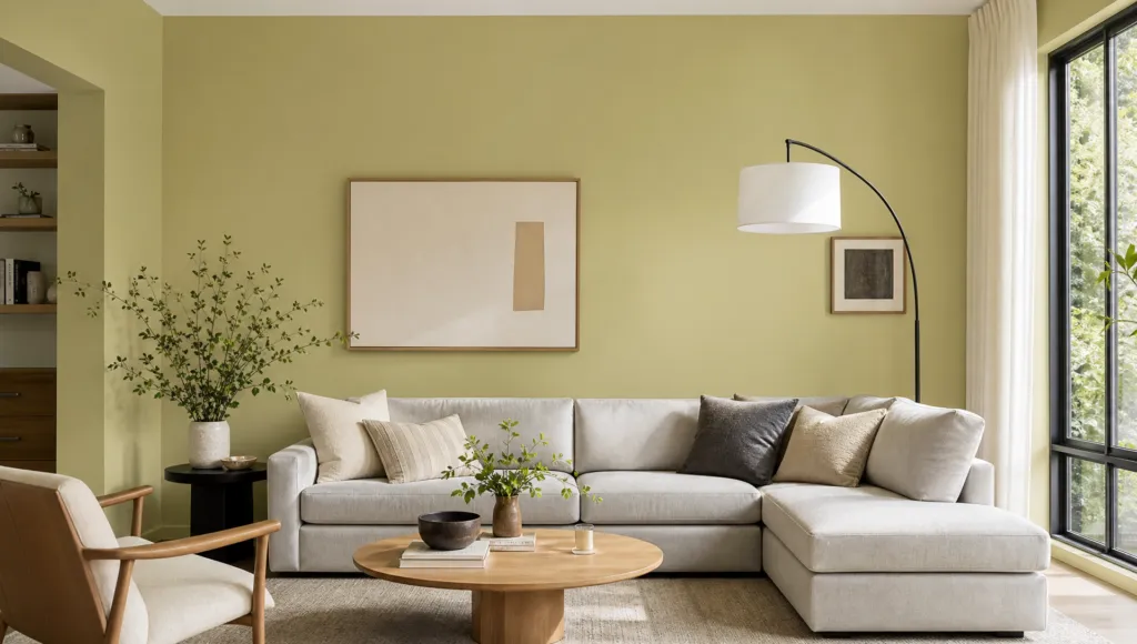
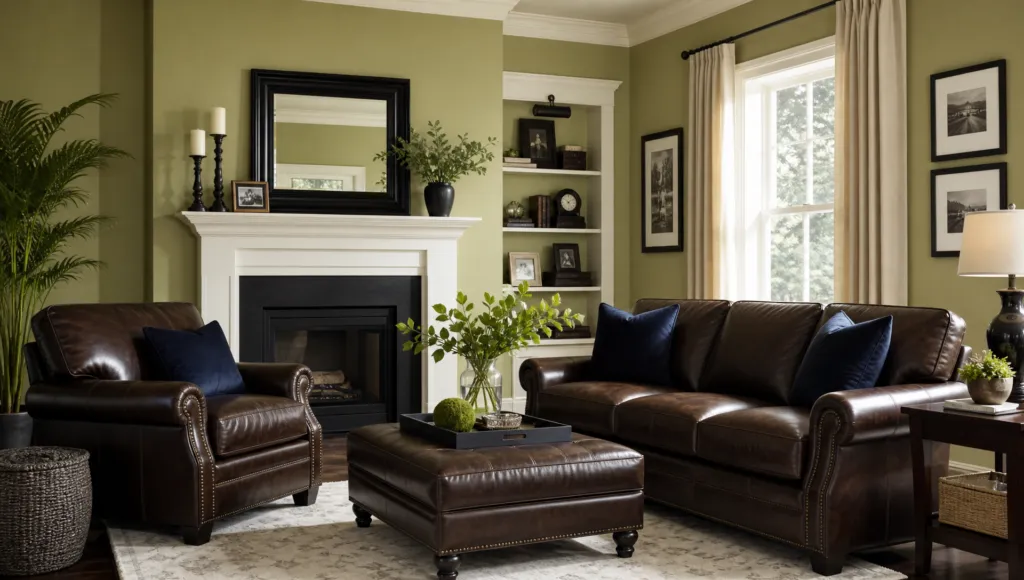
Here’s where Celery gets practical. Designers recommend pairing it with deeper, richer hues like espresso brown, soft lilacs, inky navies, and maroons. These combinations prevent spaces from becoming overly botanical or feeling like painted vegetation. Instead, they create layered, sophisticated interiors that feel intentionally curated.
This reveals something important about contemporary design: colors don’t stand alone as singular statements. They function within complex systems where multiple hues work together to create psychological depth and visual interest. Celery performs beautifully when complemented by soft whites and buttery yellows, which serve as grounding elements alongside the broader palette of herbal greens in kitchens and living spaces.
The key is using contrasting tones—particularly those deeper, earthier hues—which prevent Celery from reading as whimsical or costume-like. When paired thoughtfully, it becomes a sophisticated design choice rather than a botanical novelty. This approach reflects real maturity in how professional designers work with nature-inspired colors, moving beyond simple mimicry toward genuine psychological and aesthetic sophistication.
The Bigger Picture: ‘Rewild’ and the Future of Design Trends
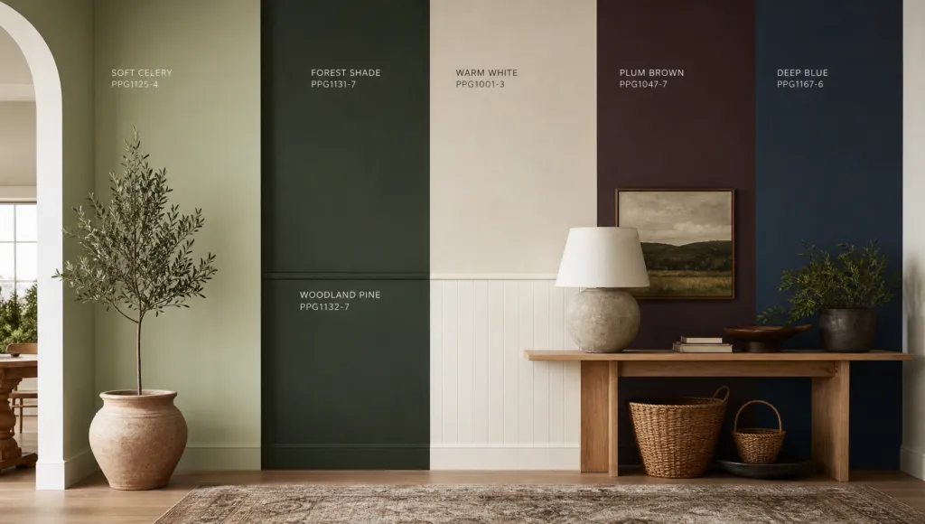
Celery doesn’t exist in isolation—it’s one component of Sherwin-Williams’s comprehensive 2027 Colormix Trend Forecast called ‘Rewild.’ This broader palette includes dark greens, warm whites, plum browns, blues, reds, and purples, creating a unified direction that transcends simple color selection and represents a genuine philosophical approach to interior design.
The ‘Rewild’ framework suggests the design world is moving toward interiors that prioritize nature-inspired elements and emotionally resonant aesthetics rooted in biophilic design principles. The specificity here matters: calming greens and blues are scientifically proven to foster psychological well-being, while the framework accommodates diverse personal styles while maintaining coherent philosophical grounding.
Other paint manufacturers will announce their 2027 Color of the Year selections in coming months, and the design world will be watching closely. Do they reinforce Sherwin-Williams’s direction or chart alternative courses? The answer will reveal whether nature-inspired design represents a lasting cultural shift or simply another trend cycle. Given the breadth of ‘Rewild’ and the industry-wide momentum already visible in 2026 kitchen trends, it feels like the former—positioning 2027 as a genuine inflection point in how we fundamentally design and experience our homes.