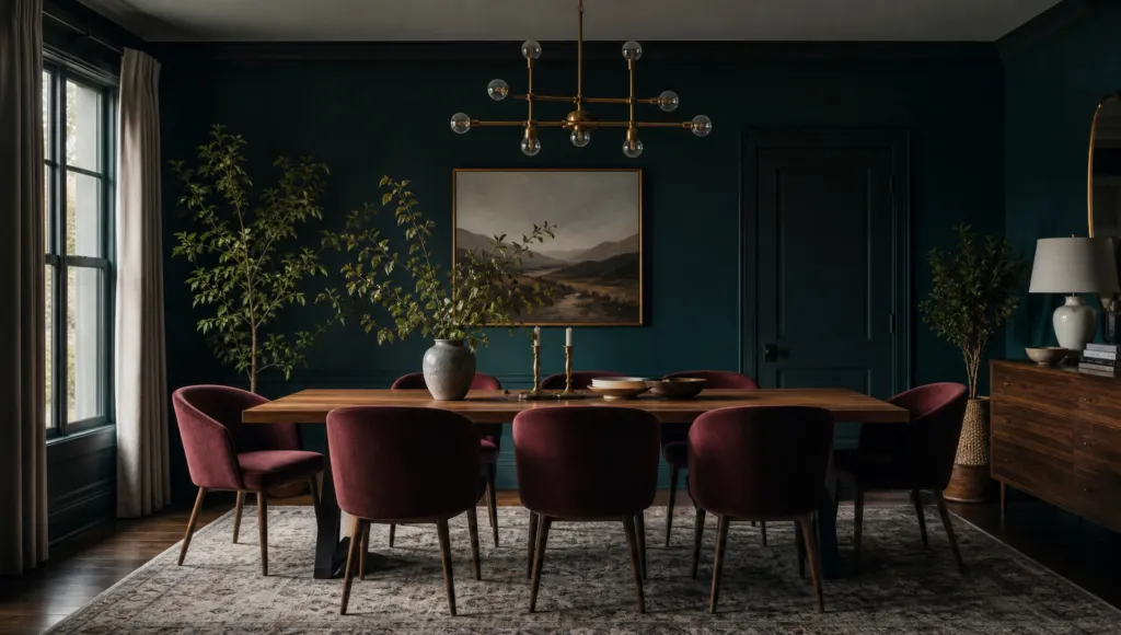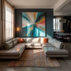
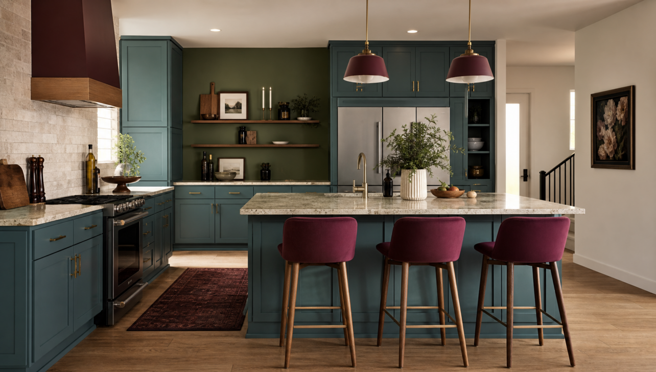
For decades, the design world preached minimalism — white walls, gray accents, and neutral everything. But in 2026, something fundamental is shifting. Leading designers are championing bold, sophisticated palettes that infuse homes with warmth, personality, and richness. This isn’t chaotic color; it’s intentional design that reflects who you are.
Deep teals are appearing in kitchens, mocha browns are replacing timid grays, and burgundy accents introduce refined luxury. Think of color as your design superpower. Strategic color application expresses individuality in ways that neutral spaces simply can’t match.
The Foundation: Color Theory in Practice
This evolution relies on proven color theory: using neutral backgrounds balanced with accent colors creates visual hierarchy and emotional impact. Layering different finishes — matte, satin, wood, and gloss — with bold hues amplifies sophistication that flat, monochromatic spaces cannot achieve. You’re not just painting walls; you’re orchestrating an experience.
The 2026 palette spans from warm off-whites and soft mocha tones to rich browns, moody purples, and blue-greens. Each color is chosen with intention and care, creating homes that feel both curated and lived-in.
Teal, Burgundy, and Herbal Greens: The Three Colors Quietly Taking Over
While mainstream design conversations revolve around beige and white, a different conversation is happening in design studios worldwide. Designers are reaching for jewel tones and natural greens — colors with real depth and sophistication that make people stop and notice.
Teal: Calming Luxury
Teal brings instant sophistication to kitchen cabinetry and accent walls, creating an environment where people instinctively breathe more deliberately. As a cool color, teal recedes and calms the viewer, making it perfect for spaces where you want to unwind.
Burgundy: Rich and Energizing
Burgundy adds unexpected richness, carrying historical weight while feeling entirely contemporary. As a warm color, burgundy advances and stimulates, creating energy and presence in dining rooms and entryways.
Herbal Greens: The Bridge
Muted, natural greens recall the botanical world without feeling trendy or temporary. These colors are mood-transforming; they don’t just look good — they alter how you feel when you’re in the space.
Making It Work Together
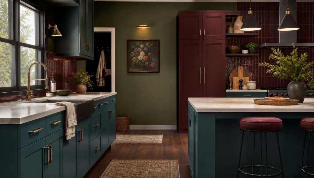
When layered with complementary neutrals and textures — like pairing rich teal with warm whites and natural wood — their impact deepens significantly. This approach aligns with mid-century modern principles: bold accent colors balanced with neutral palettes create visual interest while maintaining cohesion.
Why the ’70s Are Back (But Looking Nothing Like the ’70s)
The 1970s occupy a unique place in design history — revered for authenticity yet ridiculed for excess. In 2026, designers are extracting the era’s best qualities while deliberately discarding dated elements.
The ’70s Palette, Reimagined
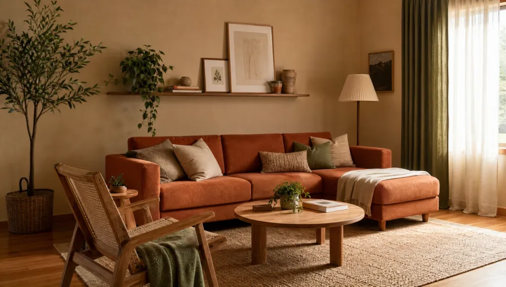
The original ’70s palette of ochre, moss green, and terracotta carries undeniable richness. Modern designers are reimagining these colors as contemporary neutrals rather than period references. Think of ochre as a warm, sophisticated backdrop (not a statement), moss green as a bridge between nature and design, and terracotta shifting from rustic to urban luxury.
What’s Different This Time
Designers are stripping away heavy wood and ornate fixtures while preserving the earthy, grounded feeling that made the ’70s special. The result? Contemporary spaces that feel rooted and authentic without looking retro.
A Winning Combination
Pairs like sand + terracotta + moss green create richly-layered interiors that feel both current and timeless. When enhanced through varied finishes and organic textures, they achieve sophistication that transcends any historical moment. This philosophy echoes mid-century modern principles — prioritizing natural materials that create genuine warmth, a foundation for how contemporary designers approach color and texture selection today.
Pale Neutrals: The Secret Weapon You’re Overlooking
While bold colors capture headlines, an equally important shift is happening within the neutral spectrum. Pale beiges and greiges offer a sophisticated comeback — not the sterile, cold neutrals from the minimalist era. These evolved neutrals bridge boldness and restraint, letting you embrace color without feeling overwhelmed.
Quiet Pastels for Depth
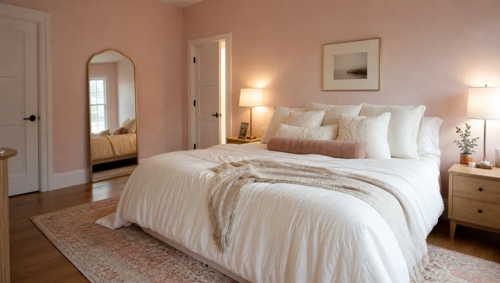
Barely-there pinks, whisper-soft blues, and muted lavenders provide visual interest without dominating your space. Soft mocha tones deserve particular attention for their transformative potential, providing comfort and sophistication simultaneously.
The Strategic Approach
Designers use pale neutrals as anchoring elements, allowing bolder colors to shine without visual chaos. Rather than treating all colors as equally weighted, contemporary designers strategically choose which colors take the spotlight and which recede.
Real-World Combinations
Try combinations like putty + warm white + oak to create sophisticated depth without sacrificing clarity. These layered palettes work beautifully across bedrooms, living spaces, and home offices — proving the versatility of thoughtfully selected pale neutrals. The result is spaces that feel refined without being cold or sterile.
Your Flooring Just Became More Important Than Your Wall Color
For years, flooring operated as an afterthought — something you picked quickly to ‘match’ your décor. In 2026, this hierarchy is inverting. Designers now treat flooring as the anchoring element determining your entire color palette.
Natural Wood: Your Design Foundation
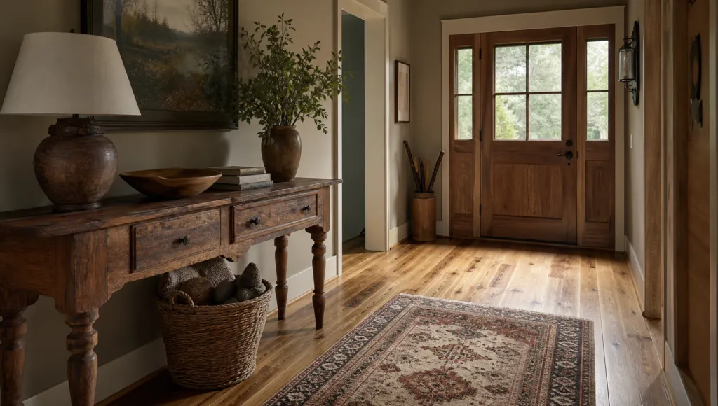
Natural wood tones provide stability and warmth complementing adventurous colors elsewhere. Walnut, oak, and hickory create solid foundations upon which bolder colors confidently rest. This emphasis on natural materials echoes mid-century modern design — prioritizing wood, stone, and metal for genuine warmth and timeless elegance.
Beyond Basic Wood
Patterned flooring is gaining real traction, introducing visual complexity through subtle variations and geometric possibilities. Textured finishes represent another critical evolution — matte and subtly textured finishes create warmth and prevent that sterile feel that hard, glossy floors can create.
Tying It Together
Warm neutrals in flooring — soft grays, subtle taupes, and barely-tinted naturals — create cohesion across your entire color scheme. These foundational choices harmonize with expanded 2026 paint colors, from warm off-whites to rich browns and blue-greens. Flooring has transformed from background element to strategic design partner.
The Color Combination That’s Changing Design: Earthy + Moody + Serene
Hidden within contemporary design’s most successful transformations is one powerful principle: strategic pairing of earthy tones with moody colors creates unexpected harmony. Here’s how it works:
When rich kitchen colors like deep teal or burgundy anchor in warm, earthy flooring, the bold color gains grounding and sophistication. Complementary accents in pale neutrals then operate as visual resting places, creating rhythm and preventing eye fatigue. This formula is rooted in genuine color harmony, psychological response, and visual balance.
Understanding the Science
Color hues interact in predictable ways. The interplay between light neutrals and darker tones creates dynamic visual interest and establishes focal points without overwhelming you. Designers transform kitchens, living rooms, and bedrooms into thoughtful statements reflecting intention and refinement.
The Both/And Approach
2026’s philosophy rejects false choices between boldness and restraint. Instead, it embraces a both/and approach: bold where it matters, grounded throughout, balanced by strategic restraint. This multisensory approach considers how color affects human behavior — overstimulating or calming depending on environment and composition.
This maturity suggests future design will embrace increasingly nuanced, psychologically sophisticated approaches as homeowners seek authentic spaces with visual coherence. Your home should look good and feel good to live in.