Terracotta has been shaping human spaces for over 10,000 years, yet most of us use it without truly understanding its power.
What’s exciting is that in 2026, designers are rediscovering terracotta in ways that feel completely fresh—nothing like those dated ’70s versions you might be picturing.
If your interiors feel a bit flat and uninspired, terracotta might be exactly what’s missing. Here’s what’s changed: Interior designers across the country have discovered that terracotta creates warmth and depth that neutral beiges simply can’t match.
The science is surprisingly elegant—terracotta’s distinctive reddish-orange tones come from iron oxide in the clay.
When fired at around 1,000°C, those iron oxides react with oxygen to create those warm, inviting hues. Your brain actually responds to these earthy colors on a fundamental level, which is why terracotta feels emotionally grounding in virtually every culture.
Unlike trendy colors that fade after a season, terracotta’s appeal endures because it’s connected to nature itself—something humans instinctively find comforting.
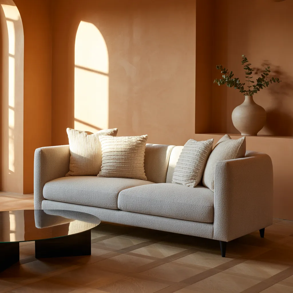
The key difference in how designers use it now? They layer it strategically with varied textures and finishes—combining matte walls with glossy accents, woven textures, and natural materials.
This creates sophisticated depth that transforms entire rooms into cohesive, inviting spaces, rather than overwhelming them with one big block of color.
The Color Combinations Nobody Expects (But Everyone Loves)
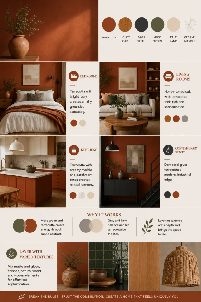
Forget the obvious pairings of terracotta with soft whites and creams.
Yes, those work, but designers are creating something far more interesting by mixing terracotta with unexpected partners: honey-toned oak, dark steel, moss green, pale sand, and creamy marble.
These combinations break the rules while maintaining elegance—and the best part is they work for different rooms in different ways.
Bedrooms: Pair terracotta with bright ivory to create an airy yet grounded sanctuary. Add neutral patterned accents for visual interest without feeling cluttered.
Living Rooms: Honey-toned oak with terracotta feels rich and sophisticated, especially when softened with soft gray and thoughtful furnishings.
Kitchens: Terracotta works beautifully with creamy marble and parchment tones, creating visual continuity across countertops and wood elements.
Contemporary Spaces: Dark steel gives terracotta an industrial edge, transforming it into something modern and unexpected.
The real trick? Understanding why these combinations work. Moss green and terracotta create subtle visual tension that energizes a space, while gray and ivory serve as neutral anchors that let the terracotta shine without overwhelming the eye.
Layer these with varied textures—matte terracotta walls with glossy finishes, natural wood, and woven elements—and you’ve got genuine sophistication.
How Modern Design Rescues Terracotta From Feeling Stuck in the ’70s
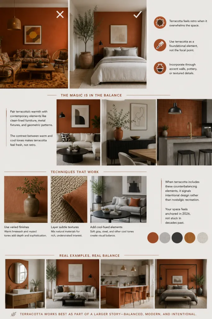
The difference between dated and timeless? Execution. The reason terracotta feels retro to many people is simple: in the ’70s, designers covered entire walls in bold terra hues.
It was overwhelming. Today’s approach is completely different. Modern designers use terracotta as a foundational element, not a dominating force.
Maybe it’s a single accent wall, pottery pieces, or textured accents that punctuate minimalist spaces.
The real magic happens when you pair these warm tones with contemporary elements—clean-lined furniture, metal fixtures, geometric patterns.
Your brain registers the contrast between cool and warm tones, and suddenly that terracotta feels fresh rather than retro.
The specific techniques that work: Use varied finishes (warm limewash techniques paired with muted, sophisticated tones), incorporate subtle texture layering, and add cool-hued elements like soft gray or steel.
When terracotta includes these counterbalancing elements, it signals intentional design rather than nostalgic recreation. Your space feels anchored in 2026, not stuck in decades past.
Real examples show the pattern: terracotta works best when it’s not the only story in the room. Combine it with whitewashed or patinated finishes, contemporary materials, and enough cool-toned elements to create visual balance.
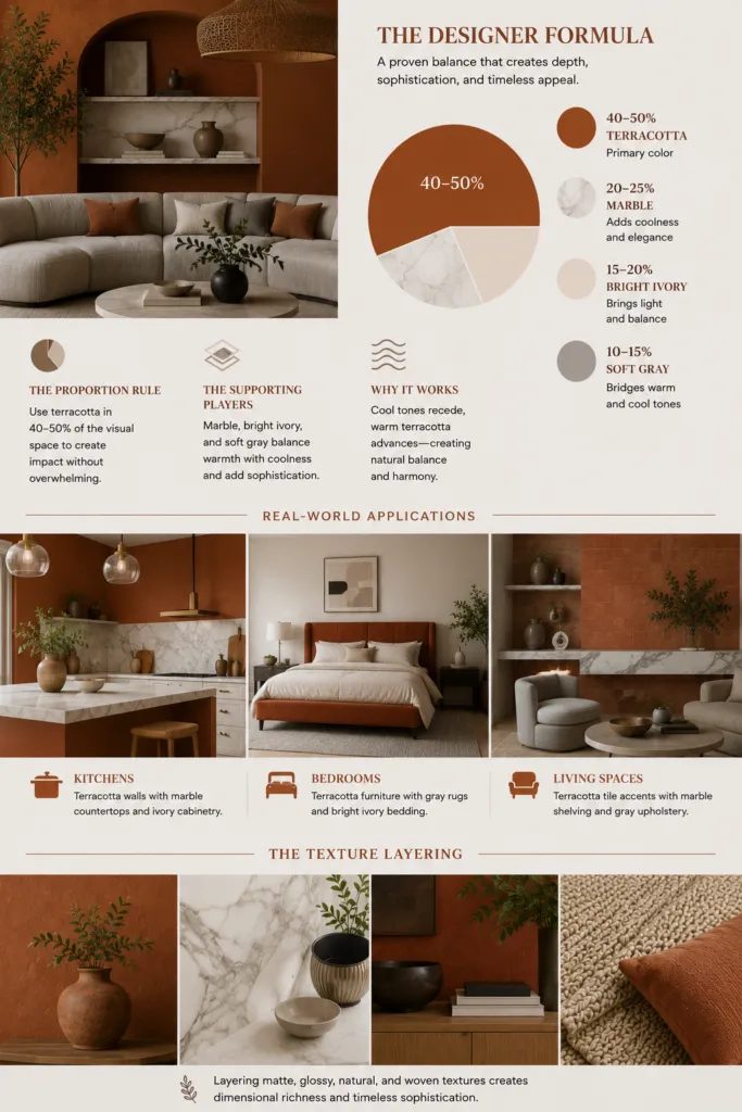
The Designer Formula for Instant Sophistication
Professional designers use a surprisingly consistent approach that creates visual depth and sophistication. Once you understand the formula, you can replicate it in any room.
The Proportion Rule: Terracotta should occupy about 40-50% of a room’s visual space when it’s your primary color. This prevents it from feeling overwhelming while letting it command attention.
The Supporting Players: The remaining space should include marble (which adds coolness and elegance through natural veining), bright ivory accents (through textiles, artwork, or trim), and soft gray (which bridges warm and cool tones and adds sophistication).
These elements work together because cool tones visually recede, allowing warm terracotta to advance naturally—no visual drama needed.
Real-World Applications:
- Kitchens: Terracotta walls with marble countertops and ivory cabinetry.
- Bedrooms: Terracotta furniture with gray rugs and bright ivory bedding.
- Living Spaces: Terracotta tile accents with marble shelving and gray upholstery.
- The Texture Layering: The final sophistication comes from combining matte terracotta walls with glossy marble, natural wood elements, and woven textiles.
This dimensional richness is what separates a simple color choice from a genuinely cohesive interior that feels both personal and timeless.