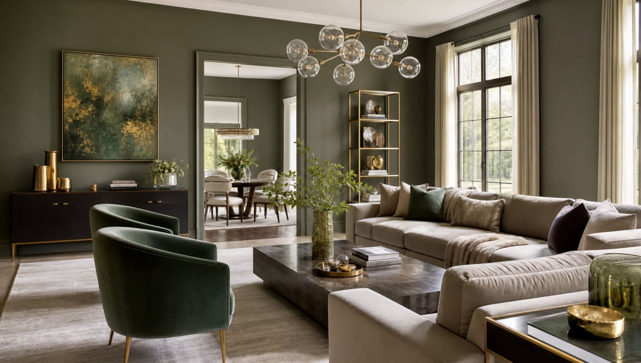
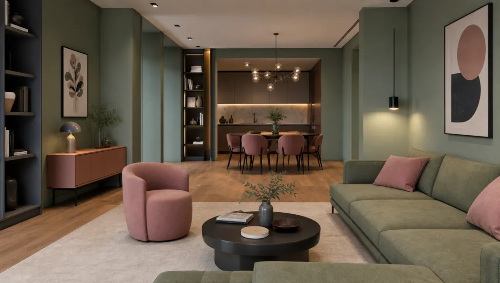
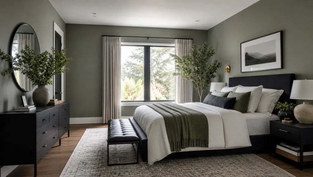
Interior designers are abandoning safe color choices, but not in the way you might expect. Instead of bold, aggressive hues, today’s design movement draws inspiration from the 1970s through a sophisticated lens—think muted gray-greens, moss tones, and warm earth saturation rather than avocado appliances and shag carpet.
This shift signals something important about contemporary design philosophy. Designers aren’t recreating the ’70s; they’re extracting the *color sensibility* of that era—how muted, earthy tones create warmth and complexity in a space. Sherwin-Williams’ selection of Celery as its 2027 Color of the Year confirms this industry-wide movement toward nature-inspired greens.
What makes this approach work is its foundation in color theory. These aren’t intuitive choices; they’re strategic decisions based on how colors behave together. A muted green works because of its specific wavelengths and saturation levels—measurable properties that designers use intentionally. The result feels modern precisely because the color placement is thoughtful rather than nostalgic.
The real sophistication lies in execution: matching these palettes with contemporary furniture, clean lines, and intentional lighting. When you see a high-end interior featuring moss green walls or emerald ceilings, that sense of “timeless modern” you feel isn’t accidental—it’s the result of careful calibration between color choice and supporting design elements.
Why Muted Jewel Tones Are Replacing Safe Neutrals in Luxury Design
Walk into a high-end contemporary interior today and you’ll likely encounter colors that initially feel unexpected: muted greens, soft earth tones, and jewel-inspired hues where you’d once have found neutral grays or warm beiges. This shift reveals how luxury design has matured beyond the “bold or safe” binary into nuanced territory where color carries intelligence and purpose.
Designers recognize that green tones specifically offer remarkable versatility. They can create calming effects in bedrooms and studies while maintaining energetic properties in living spaces and kitchens—giving designers precision tools for shaping how a room functions psychologically. The sophistication isn’t in bright saturation; it’s in strategic placement and emotional impact.
What distinguishes this trend from previous nostalgic revivals is the calibration behind every choice. These colors work because designers apply color harmony principles—using analogous colors positioned near each other on the color wheel to create cohesive, intentional experiences rather than visual chaos. When you introduce a muted moss green or gray-green tone, you’re not simply changing a wall; you’re altering how the entire room functions, both visually and psychologically.
This represents quiet confidence—rooted in knowledge rather than trend. Color psychology demonstrates these tones evoke specific emotional responses that establish trust and familiarity, transforming a room from merely beautiful into genuinely meaningful.
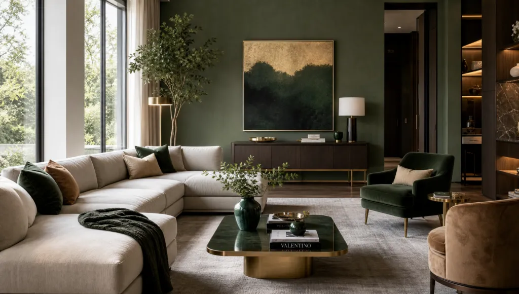
Beyond the Accent Wall: How to Distribute Color Strategically
The accent wall has had its moment. For nearly two decades, this quick fix worked: one bold wall could transform an otherwise neutral room. But leading interior designers have moved on, and here’s why: accent walls treat color as a flat, two-dimensional problem.
Color theory teaches us that colors seen together create harmony or discord based on their relationships. A single accent wall creates tension but often feels incomplete—even static. The new approach distributes color strategically across the entire room, considering ceiling heights, natural light sources, and how your eye actually moves through the space.
Instead of concentrating intensity on one wall, contemporary designers use black and white elements as anchors that support more sophisticated color distribution. Black decreases the apparent brightness of colors paired with it, while white showcases all hues equally. These neutral tools allow bold colors to breathe throughout a room rather than scream from a single plane.
The philosophical shift is significant: from “add drama” to “create layered visual experience.” Think about color three-dimensionally, and you’re no longer asking how to make a room look interesting—you’re asking how to make it feel intentional through carefully balanced color relationships. This evolution reflects broader design maturation: we’re moving away from strategies that announce themselves loudly and toward those that reveal themselves gradually, rewarding closer observation and deeper engagement.
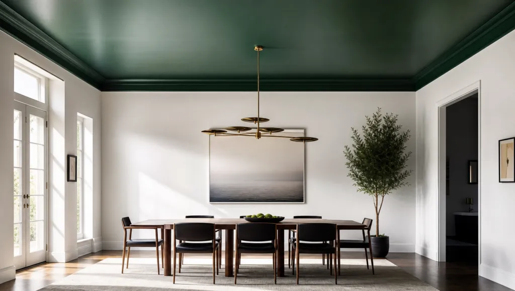
Your ceiling has been invisible for too long. In most homes, this fifth wall is treated as an afterthought—typically white and designed to fade into insignificance. Yet designers are rediscovering what previous generations knew: the ceiling holds untapped potential for visual and emotional impact.
By moving saturated greens and jewel tones upward, designers anchor spaces in ways traditional wall treatments never could. A colored ceiling fundamentally changes how you experience a room’s proportions, light quality, and even your psychological comfort. This isn’t decoration—it’s environmental psychology applied through color.
Emerald green deserves particular attention here. As a blue-green with high brightness and strong saturation, emerald serves as a dramatic anchor without overwhelming a space. Its natural vibrancy establishes visual hierarchy without aggressive intensity. When positioned overhead, these luminous properties transform how light interacts with the entire room.
What makes ceiling color particularly powerful is its subtlety. Unlike a painted wall at eye level, ceiling color works on your perception subconsciously—you absorb it without confrontation, making it paradoxically more influential than a bold wall treatment. A muted moss tone overhead creates enclosure and intimacy without the visual weight a colored wall might introduce.
High-end interiors increasingly feature strategic ceiling treatments in sophisticated greens and earth tones, creating immersive environments that feel both modern and timeless. The result is transportive—these spaces don’t announce their design choices; they reshape how rooms function emotionally and visually.