After a decade dominated by stark white walls and minimalist palettes, something warm and unexpected is reshaping modern interiors: rich brown tones are making a sophisticated comeback.
Chocolate brown, ochre, and muted terracotta are no longer relegated to vintage archives—they’re being recognized as contemporary luxury neutrals that bring depth, warmth, and grounded elegance to modern spaces.
This shift challenges decades of design convention, proving that sophistication doesn’t require sparse, cold palettes. What’s particularly interesting is that this isn’t nostalgic throwback design.
Today’s brown tones—especially those with subtle pink undertones—function as modern neutrals that feel intentional and current.
As a warm, unsaturated color, brown naturally calms and soothes rather than stimulates, making it psychologically perfect for bedrooms, living rooms, and other spaces designed for relaxation.
Beyond aesthetics, designers are increasingly recognizing brown’s emotional benefits: it evokes stability, comfort, and natural connection—qualities especially valued in our hyper-digital world.
The real sophistication lies in understanding that brown’s versatility extends far beyond brown-on-brown schemes. It pairs beautifully with warm caramel accents, cool midnight blues, muted greens, and even unexpected pops of color, proving that understanding color relationships—both emotionally and visually—has become essential to contemporary design.
The Secret Palette Designers Are Using to Make Brown Feel Current, Not Retro
The trick isn’t using brown alone—it’s pairing it with the right complementary tones that feel contemporary rather than dated.
Professional designers layer chocolate brown with muted gray-green, moss accents, soft whites, and warm lighting to create richly layered schemes that feel sophisticated and intentional.
The key is balancing warm earth tones with cool, muted accents that prevent the space from sliding into pure ’70s nostalgia.
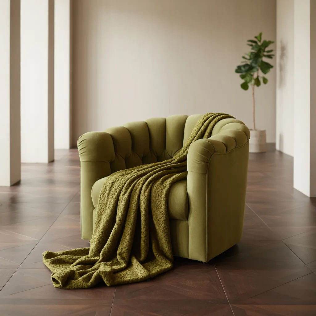
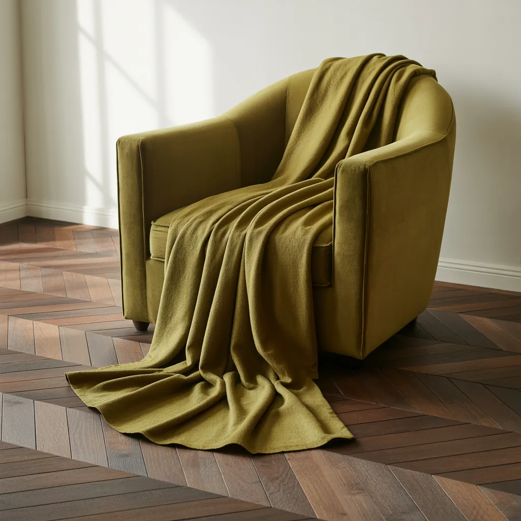
Here’s what’s working right now: chocolate brown pairs beautifully with soft moss-green for understated elegance, or with citrus-yellow for vibrant contrast that feels modern rather than retro.
Peachy terracotta softens the look, while dramatic pairings like burgundy or midnight blue add graphic interest without overwhelming the space.
Even unexpected combinations—like chocolate brown with pistachio-green or warm cream—create visual interest while maintaining overall harmony.
Strategic color blocking is essential here. Rather than using brown everywhere, successful schemes treat chocolate brown as a neutral anchor that allows accent colors to shine.
Black and white function as universal helpers: white makes every hue pop, while black mutes saturation for more sophisticated effects.
Think of it as the “color pop” strategy—your brown walls or flooring become the grounded backdrop, letting vibrant art, plants, or textiles steal the show.
How to Steal Design Ideas From High-End Hotels and Showrooms
Want to know the difference between a professionally-designed space and an amateur attempt? Look at how the best designers use restraint. Take a chocolate brown herringbone floor paired with warm white walls and olive green accents—it’s effortlessly sophisticated because every color choice is deliberate.
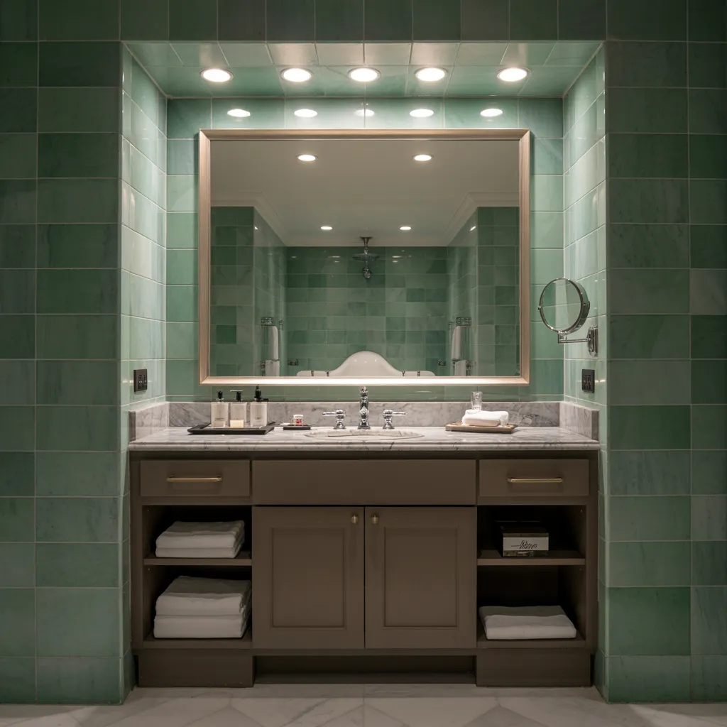
Luxury bathrooms featuring green marble and dark wood cabinetry work beautifully.
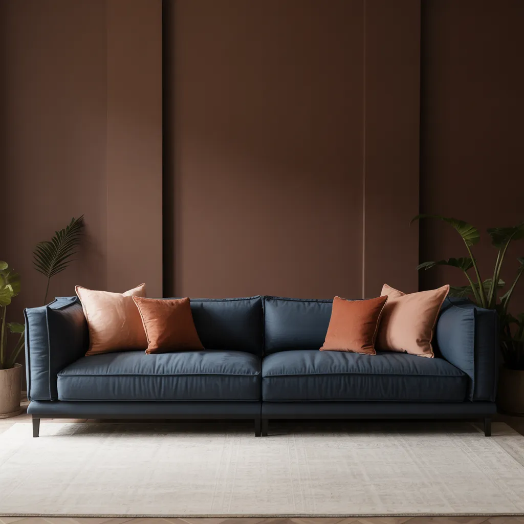
Living rooms anchored by navy couches against chocolate brown accent walls feel both grounded and contemporary.
The pattern separating inspired spaces from kitsch? Thoughtful curation and strategic restraint. High-end hotels and design showrooms lean on this formula repeatedly because it works across different architectural styles, budgets, and personal tastes.
Chocolate brown functions as the perfect anchor—versatile enough to ground vibrant citrus accents on one project, yet sophisticated enough to complement moody navy elements in another.
Professional designers understand something fundamental: color is a powerful tool that affects how we think, feel, and perceive our surroundings.
The right combination can make a room feel larger, smaller, or more intimate. It can energize or calm. That’s why professional spaces feel intentional and elegant—every color choice serves a purpose beyond pure aesthetics.
Beyond Beige: Why Neutral Spaces Are Finally Getting Interesting Again
Modern minimalism has hit a turning point. After years of relying on monochromatic beige and white schemes, designers are discovering that neutrality doesn’t mean boring—it means intentional layering.
Today’s sophisticated neutral palettes combine chocolate brown, ochre, muted greens, and soft cream in carefully considered combinations that create visual interest while maintaining the calm restraint that makes minimalism appealing.
The evolution feels almost obvious in hindsight: depth and restraint aren’t opposites—they’re complementary. Chocolate brown functions as a luxury-inspired neutral that brings warmth pure minimalism simply cannot achieve.
By introducing brown’s subtle complexity through careful pairings—soft caramel tones, peachy terracotta linens, rust accents, or unexpected cool elements like midnight blue—designers create sophisticated comfort that feels lived-in and inviting rather than sterile and cold.
psychology here is compelling: while pure minimalism looks clean, it can feel emotionally cold or austere. By understanding how color affects human behavior and emotional response, contemporary designers have reimagined neutrality itself.
They’ve proven that warmth and restraint complement each other beautifully, creating gallery-quality environments that feel both thoughtfully curated and genuinely comfortable. This is sophisticated design that actually invites you to relax.