Most homeowners unknowingly make a costly design mistake: they try to incorporate every popular trend at once. It’s tempting—you see inspiring designs across social media and want to weave them all together.
But here’s what actually happens: a contemporary vanity clashes with farmhouse tile, industrial lighting fixtures compete with minimalist accessories, and the whole space ends up feeling fractured and confused.
Design professionals have a name for this: “trend stacking.” And it’s the fastest way to date your bathroom. Paradoxically, the urge to make your space feel current and beautiful is exactly what makes it feel outdated.
The sophistication factor: restraint wins.
The bathrooms that transcend trends aren’t the ones with everything—they’re the ones with a clear vision executed with intention. Choose one design direction that resonates with you, then commit to it fully. Whether that’s spa-like minimalism, cozy contemporary, or modern farmhouse, let that single aesthetic guide every material, color, and fixture decision. This cohesive approach not only looks more polished—it actually stays relevant longer.
Why Your All-White Bathroom Might Feel Like a Sterile Clinic
The all-white (or all-gray) bathroom seemed foolproof. Clean, versatile, timeless—what could go wrong? As it turns out, plenty. While monochromatic palettes are certainly safe, they often feel emotionally empty and clinical rather than calming.
Design experts are pushing back hard against this trend. Yes, a blank canvas is easy to work with, but there’s a difference between elegant simplicity and cold sterility. Your bathroom should feel like a sanctuary, not a hospital room.
Here’s the shift happening now:
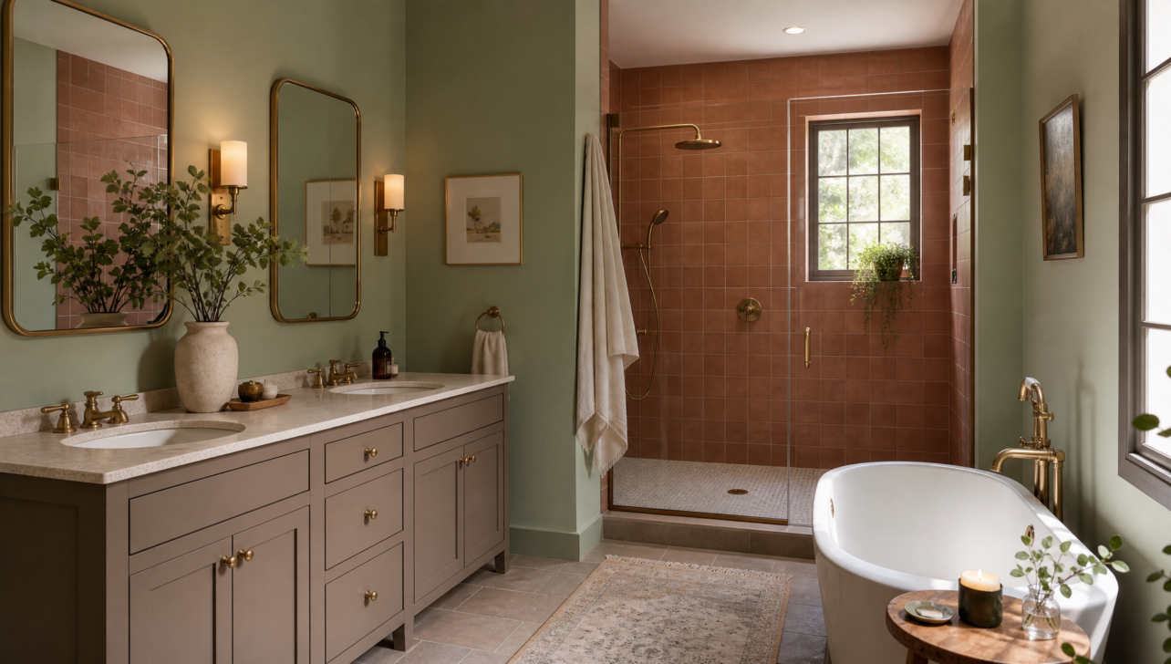
Bathrooms are embracing intentional warmth through layered, sophisticated color choices. A soft sage green, warm terracotta accent, or subtle taupe undertone brings character and psychological comfort without sacrificing sophistication.
Even small touches—a single accent wall, colored cabinetry, or warmly toned tile—transform a bathroom from functional to genuinely inviting. The key is choosing colors that feel intentional rather than random, allowing neutral tones to support (not dominate) the design.
The Oversized Tile Trap (And Why Proportion Matters)
Large-format porcelain tiles dominated bathroom renovations for nearly two decades, but design experts now caution against treating “bigger” as automatically “better.” The reality? Oversized tiles can actually cheapen a space when chosen without intention.
Here’s why: monotonous expanses of massive tiles create visual flatness and missed opportunities for texture, pattern, and visual interest. The assumption that scale automatically signals sophistication has led to countless bathrooms that feel sterile rather than curated.
The emerging approach:
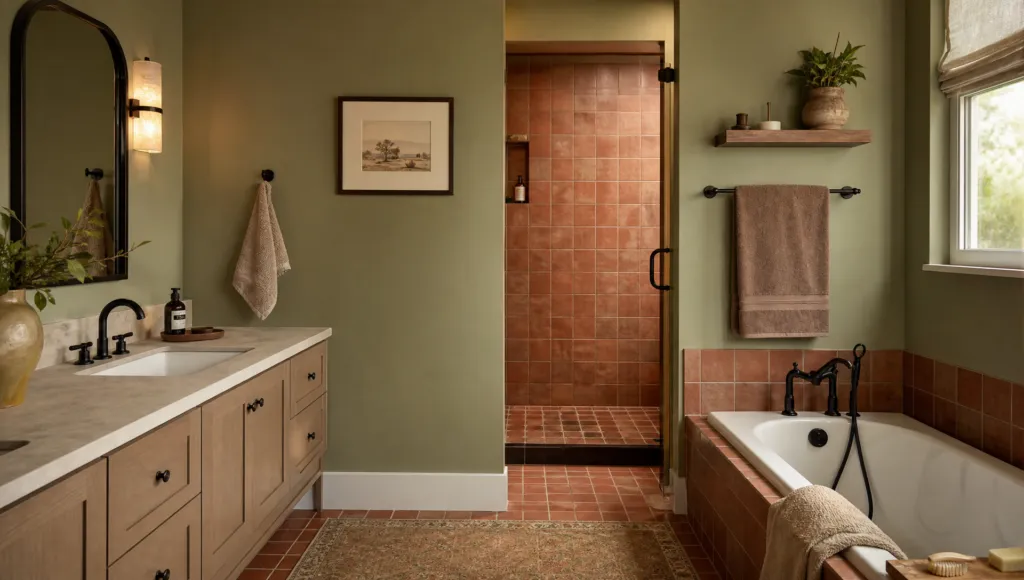
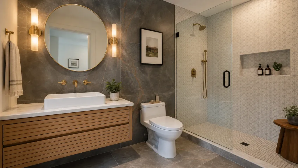
Design professionals are rediscovering the power of variety and proportion. This doesn’t mean going back to tiny subway tiles everywhere—it means mixing sizes thoughtfully.
Consider combining larger tiles in open areas with smaller or patterned tiles in focal zones like the shower or behind the vanity.
Varying tile sizes creates rhythm, prevents visual boredom, and actually highlights quality materials rather than emphasizing them to exhaustion. Material quality and visual intention now matter far more than pure tile dimensions.
The Matching Finishes Problem (And Why Imperfection Looks Better)
That obsessive urge to match everything—fixtures, hardware, lighting, accessories—all in identical finishes? That’s actually working against your bathroom’s sophistication. Perfectly coordinated bathrooms often feel rigid and uninviting, almost like showroom displays rather than lived-in spaces.
Glass blocks and other deliberately matchy-matchy styling choices now read as distinctly dated, signaling a specific era rather than timeless design.
What’s replacing it:
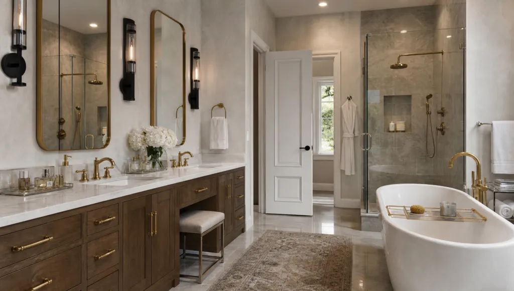
Mixed finishes and complementary (not identical) choices create genuine depth and visual interest. Try pairing brushed brass hardware with matte black lighting fixtures, or combining polished chrome with warm copper accents.
These intentional contrasts feel collected and sophisticated—like you’ve chosen each piece for its own merit rather than its ability to match everything else.
The secret is ensuring your mixed finishes share a unifying aesthetic (like a warm metallic palette or a cool-toned spectrum) so they feel intentional rather than chaotic.
Materials That Get Better With Time (The Opposite of Trendy)
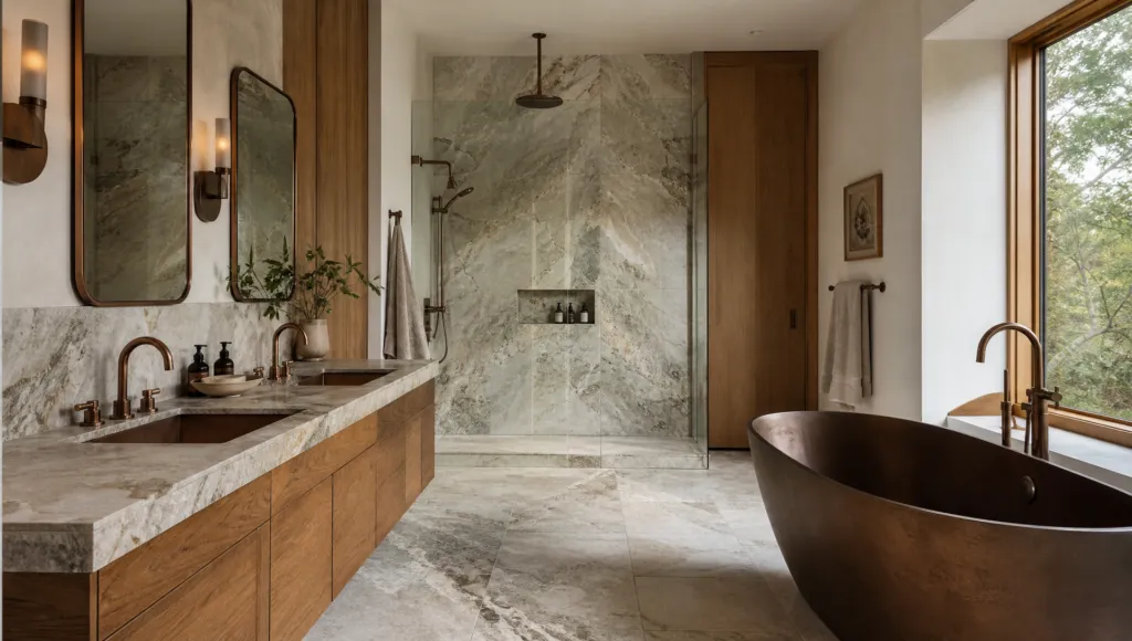
Here’s what separates timeless bathrooms from dated ones: the materials you choose either improve with age or demand perfection to stay beautiful. Natural stone, warm wood, and soft metals fall into the first category—they develop character and sophistication over time.
Marble, limestone, and granite tell stories through their veining and color variations. What once seemed like “flaws” are now understood as authentic marks of quality and age. A subtle water spot or patina isn’t a disaster—it’s proof your bathroom is living and breathing, not frozen in time.
Why this matters:
Trendy materials often look cheap as they wear, requiring constant maintenance to stay pristine. But organic materials with natural variations?
They actually get more sophisticated with time. They develop patina. They show character. This is the foundation of expert bathroom design philosophy: invest in materials that won’t date themselves and that improve with everyday use. Your future self will thank you when your bathroom still feels elegant in 10 years, not “so 2026.”