For decades, kitchens followed an unspoken rule: keep it neutral, keep it safe, keep it timeless. White cabinets, beige countertops, and gray walls dominated home design magazines and renovation shows. But something fundamental has shifted.
Today’s homeowners and interior designers are abandoning this conservative playbook in favor of vibrant, personality-driven color schemes that transform kitchens from purely functional workspaces into immersive, emotionally resonant environments.
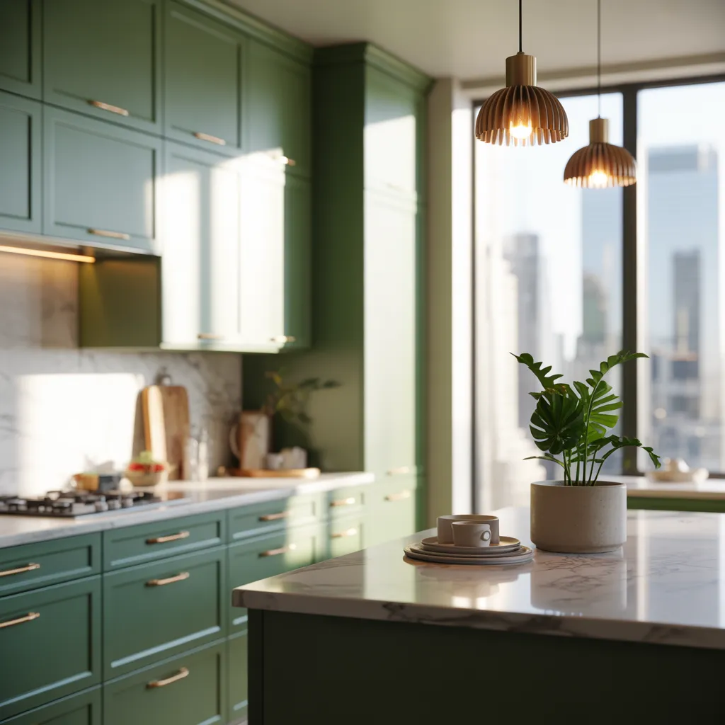
Deep forest greens, rich burgundies, moody teals, and warm ochres are no longer considered risky—they’re celebrated as essential elements of modern kitchen design.
This transformation reflects a broader cultural moment where personalization trumps trend-following and authenticity outweighs convention.
More homeowners now ask, “How can I make this kitchen feel like me?” instead of “Will this help me sell my house someday?”
Real Kitchens That Prove Color Works—48 Inspiring Examples
Real-world examples demolish the myth that bold kitchen color is somehow reckless or impractical. Across hundreds of residential projects, designers showcase stunning applications of saturated palettes applied to cabinetry, islands, and backsplashes. Here’s what’s working beautifully right now:
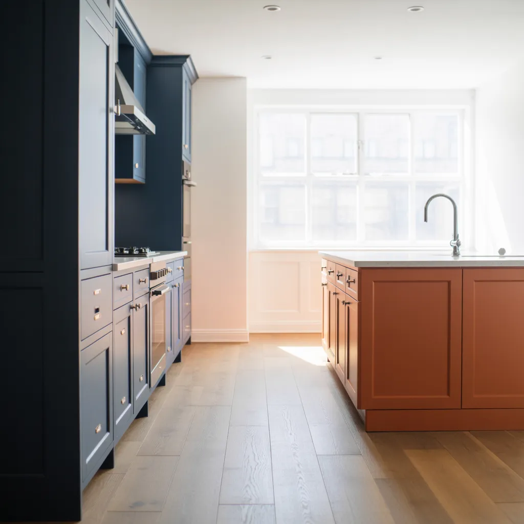
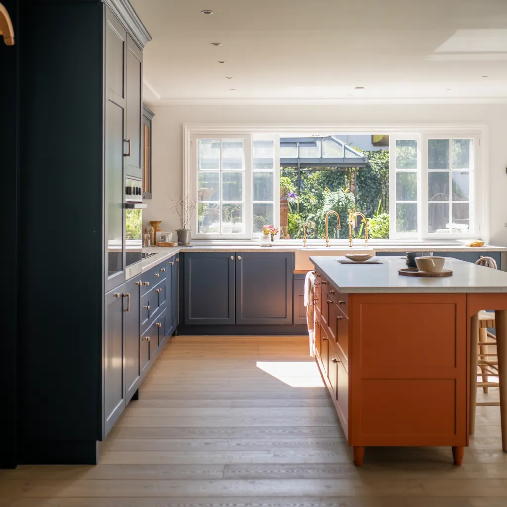
- Navy Blue Cabinets: paired with brass hardware create sophisticated anchors in contemporary spaces
- Warm Terracotta-Orange Islands: become unexpected focal points that energize open floor plans
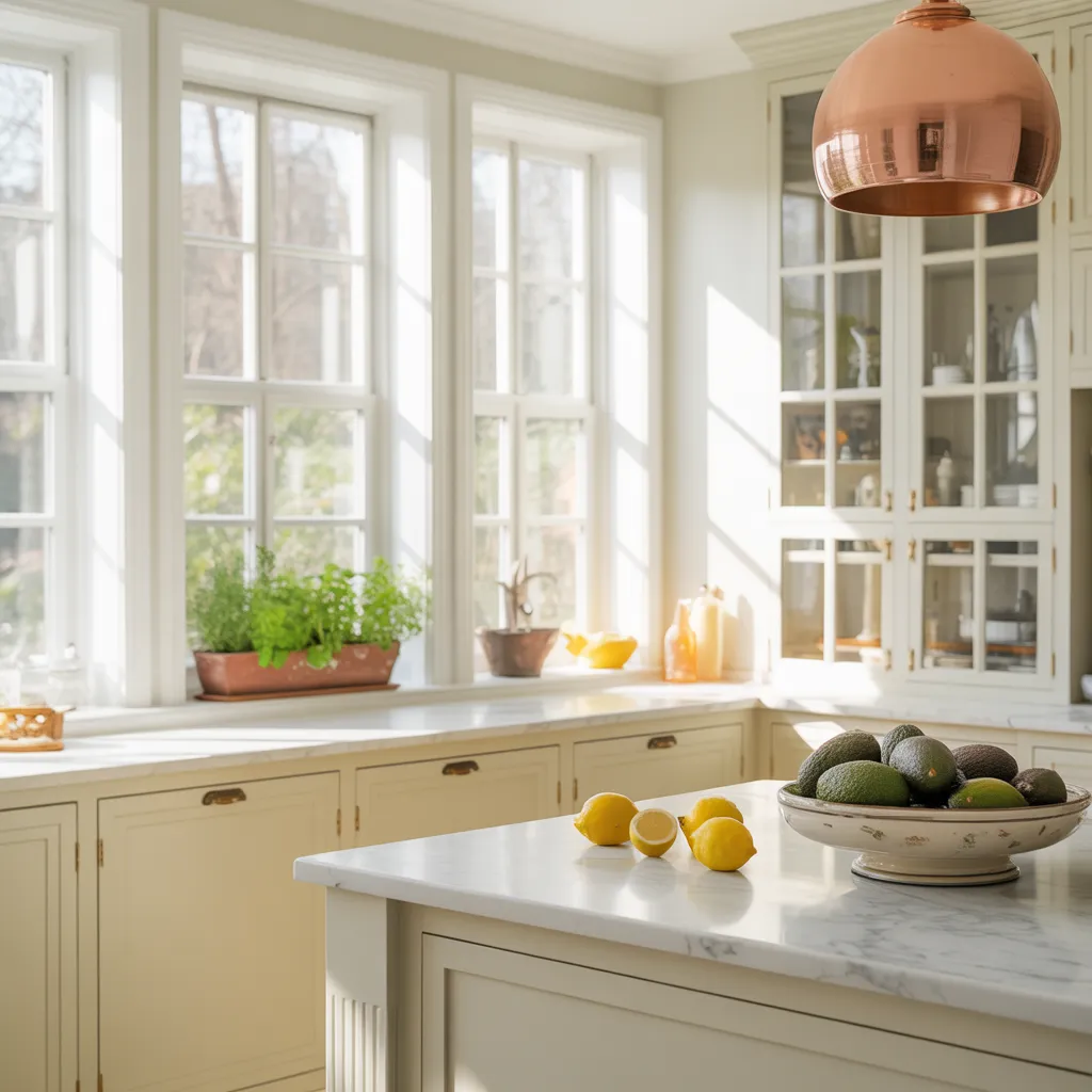
- Cheerful Butter Yellows: soften industrial materials while adding approachable warmth
- Dusty Pinks: bridge traditional and modern aesthetics seamlessly.
These aren’t isolated experimental projects—they represent successful installations ranging from intimate galley kitchens to sprawling chef’s kitchens.
What professional designers know is that color creates warmth, visual interest, and narrative depth that neutral spaces simply cannot achieve, making kitchens feel genuinely lived-in.
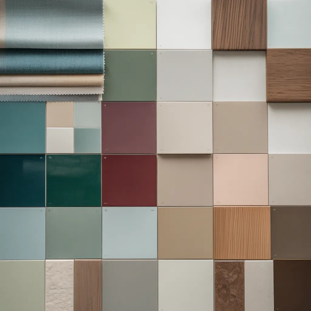
The 2026 Kitchen Color Palette: Colors Taking Center Stage
Professional designers have identified specific colors emerging as dominant forces in kitchen aesthetics heading into 2026:
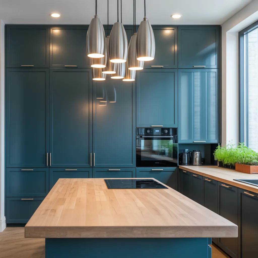
- Teal: occupies a unique position—sophisticated enough for traditional spaces yet contemporary enough for minimalist interiors. It reads differently depending on lighting, shifting from sophisticated to serene.
- Herbal Greens: ranging from muted sage to vibrant forest tones continue gaining traction as designers seek nature-inspired palettes that feel grounded and timeless. These colors work especially well if you’re drawn to botanical elements but hesitant about pure green.
- Burgundy and Boozy Red Tones: represent elegance with drama, offering richness without aggressive saturation. They’re surprisingly versatile paired with warm metallics or cool-toned hardware.
- Pale Greiges and Warm Neutrals: provide bridges for hesitant adopters, maintaining comfort while departing from expected beige monotony—perfect if you want color without commitment.
- Quiet Pastels: introduce softness through muted versions of full-spectrum colors, ideal for lighter, airier aesthetics.
- Mocha Tones: offer chocolate-inspired warmth that pairs seamlessly with modern materials and finishes, especially stainless steel and light woods.
Choosing Your Color: What Actually Works for Your Kitchen
Selecting the right kitchen color requires understanding how different hues perform in your specific space, not simply following trends. Consider these practical factors:
- Teal: thrives in kitchens with ample natural light, where its depth creates sophistication rather than darkness. North-facing kitchens? Skip the deepest teals.
- Herbal Greens: work across diverse lighting scenarios and perform exceptionally well in traditional architecture, where they echo botanical references naturally.
- Burgundy: demands consideration of proportions—spacious kitchens can handle saturated application across all cabinetry, while compact kitchens might benefit from accent placement (like the island only).
- Pale Greiges and Quiet Pastels: suit kitchens with limited natural light, preventing the shadowy feelings that deeper colors can create in dim spaces.
- Mocha: performs excellently in kitchens with warm-toned existing materials and finishes, creating cohesive, inviting environments. Before committing, paint large sample boards and observe them throughout the day in different lighting conditions.
Where to Apply Your Color: Strategic Placement for Maximum Impact
Strategic color placement transforms kitchens from monochromatic spaces into dynamic, visually balanced environments:
- Cabinet Coloring: creates the most dramatic impact—this largest visible surface establishes your overall palette tone. Going bold here means you’re committing to a statement.
- Island Coloring: provides focal point intensity while maintaining balance through spatial separation from primary work surfaces. Islands are perfect for testing bolder colors with lower commitment.
- Backsplash Coloring: introduces secondary accent layers without overwhelming the composition. Consider continuing your cabinet color here, or creating contrast with complementary hues.
- Appliance Finishes: offer subtle color integration through coordinated finishes—black, stainless, or color-matched options work here.
- Modern Color Drenching: extends beyond traditional cabinetry by coordinating walls and ceilings with cabinet selections to create immersive, envelope-like environments. This approach works beautifully in kitchens with good light and higher ceilings.
Small Kitchens and Bold Color: A Game-Changing Approach
Conventional wisdom suggests compact kitchens require light, neutral palettes to maximize perceived spaciousness. Yet professional designers increasingly demonstrate that small kitchens can successfully pull off vibrant, saturated colors—often more effectively than expansive spaces.
Here’s the secret: bold color in intimate kitchens creates sophisticated, personality-driven environments that feel intentional rather than compromised.
A small kitchen painted in jewel-toned forest green paired with strategic lighting and complementary accent colors feels luxurious and refined rather than constrained.
The Key Factors:
- Proper task and ambient illumination prevents small colorful kitchens from feeling dark or claustrophobic
- Quality finishes and hardware elevate the space beyond budget-looking – Simplified clutter keeps the color as the focus rather than visual noise.
This approach demonstrates that thoughtful kitchen design prioritizes personal expression across all spatial dimensions—because a kitchen that reflects your personality feels genuinely yours, regardless of square footage.