The design world is shifting dramatically as jewel tones—emerald greens, sapphire blues, deep purples, ruby reds, and burgundy—step out from the shadows of minimalist neutrals and take center stage.
Both interior designers and homeowners are embracing these rich, saturated colors to inject genuine personality and depth into their spaces.
This isn’t just about following a trend; it reflects a cultural movement away from sterile, one-dimensional rooms toward spaces that actually tell stories and evoke emotion.
These bold colors align perfectly with the “loud luxury” movement, which celebrates intentional, statement-making design that prioritizes opulence over minimalist restraint.
What makes jewel tones so compelling? They instantly feel luxurious and sophisticated, transforming ordinary rooms into carefully curated sanctuaries that feel both intentional and inviting.
Psychologically, these colors trigger associations with precious materials, heritage, and timelessness—creating spaces that feel grounded yet aspirational.
The beauty is that you don’t need a complete aesthetic overhaul to harness their power. A single accent wall or statement furniture piece can fundamentally redefine a room’s character and atmosphere, giving you that elevated feel without overwhelming your entire home.
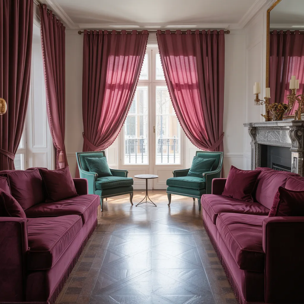
Deep burgundy velvet sofas and emerald green armchairs adorn this lavish living space, bathed in rich jewel tones that exude luxury. Heavy drapes in a matching burgundy hue frame ornate windows, while plush upholstery and gleaming tiled floors create an elegant, decadent ambiance. The stately fireplace, adorned with intricate carvings, anchors the room in timeless grandeur. This opulent interior embodies classic European refinement through its sumptuous materials, from the velvet textiles to the polished hardwood floors, blending the warmth of tradition with contemporary sophistication in the jewel-toned color palette.
The Color Combinations That Actually Work (Not What You Think)
You might assume vibrant jewel tones should stay isolated, but master designers consistently prove otherwise.
When combined with intention and strategic restraint, these colors create harmonious, visually compelling palettes that feel curated rather than chaotic. The secret lies in understanding color harmony—the principle that certain colors naturally please the eye when placed together.
Emerald and sapphire, for instance, complement each other beautifully through subtle variations in undertone and saturation. The real magic happens when you layer jewel tones at varying intensities, creating visual depth rather than chaos.
Neutral “breathing room”—cream, beige, or soft gray—between bold statements prevents overwhelm while letting each color shine.
Black and white are particularly effective: black naturally softens saturation while white elevates all hues equally.
Don’t forget texture either. Velvet, linen, and tactile materials alongside jewel tones create dimensional sophistication that prevents the look from feeling flat.
The most polished schemes often feature unexpected color pairings that use simultaneous contrast—where adjacent colors actually make each other appear more vibrant. It’s about balance, not compromise.
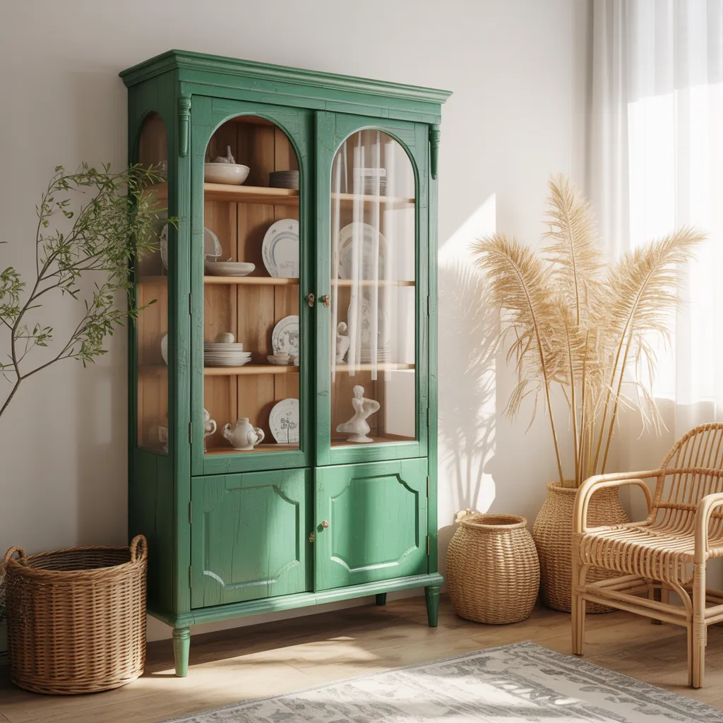
An ornate wooden cabinet in a deep emerald green hue takes center stage, its glass-paneled doors revealing a curated display of dishware and decor. This striking piece exudes a bohemian yet refined aesthetic with its ornate details and lush green finish. Woven rattan chairs, trailing pampas grass plumes, and wicker baskets integrate natural textures and warmth. The color palette combines the vibrant emerald cabinetry with neutral beiges, soft cream tones, and warm terracotta accents found in the rustic rug and ceramics, creating an inviting bohemian-inspired ambiance rich in character and visual interest.
The Biggest Mistakes People Make When Going Too Deep
Enthusiasm for jewel tones can easily overwhelm judgment, leading to spaces that feel oppressive rather than elegant. The most common mistake? Saturating entire rooms in deep colors.
These darker shades absorb light and make spaces feel smaller—a real concern if you’re prone to claustrophobia or have smaller rooms. Lighting matters enormously, and many homeowners discover too late that their chosen sapphire looks muddy in morning light or unnaturally dark by evening.
Cool-toned jewels clash with warm artificial lighting, while warm-toned versions conflict with cool natural light from north-facing windows.
Another critical error is neglecting white space. Your eye needs visual rest to appreciate color intensity fully; without it, you’ll experience visual fatigue. Additionally, introducing jewel tones without considering your existing décor creates jarring disconnects.
Finally, resist the temptation to attempt “color drenching”—painting walls and ceilings the same jewel tone—unless you’re truly experienced. This immersive approach requires exceptional skill and can dramatically alter how spacious (or cramped) your room feels. Start with accent walls or furniture, then expand if you’re confident.
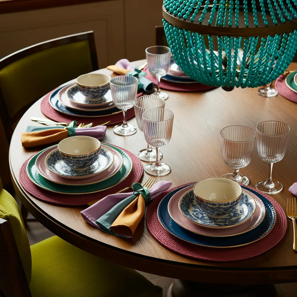
A round wooden dining table is beautifully set with place settings featuring blue and white patterned ceramic plates and bowls. Vibrant turquoise, magenta, yellow, and deep green napkins and placemats add pops of vivid color. Glass goblets and stemmed glassware await drinks. An oversized turquoise beaded pendant light anchors the lively, bohemian tablescape with an eclectic global flair. The overall aesthetic blends elements of contemporary and global styling, incorporating natural textures like wood and ceramic with jewel-toned textiles. The dominant color palette combines rich turquoise, magenta, and citron yellow, balanced by crisp white dishware and warm, natural wood tones.
Room-by-Room: Where Jewel Tones Shine (and Where They Don’t)
Strategic jewel tone application depends entirely on what each room needs to accomplish.
- Bedrooms are ideal for jewel-toned sanctuaries—an emerald or sapphire accent wall paired with rich bedding creates a luxurious retreat that promotes restful sleep. The cool properties of these colors naturally calm and relax you.
- Living rooms work beautifully with jewel-toned focal-point furniture that anchors conversations without overwhelming the space.
- Entryways gain dramatic impact from a jewel-toned feature wall or boldly painted door, establishing sophisticated first impressions.
- Bathrooms are an unexpected gem—think of them as personal wellness retreats rather than purely functional spaces. Dark burgundy transforms utilitarian bathrooms into luxurious sanctuaries when paired with complementary elements.
- Kitchens and bathrooms generally need restraint; introduce jewel tones as accents through cabinet hardware, textiles, or carefully selected feature walls rather than dominant schemes that might feel oppressive in smaller spaces.
- Home offices thrive with jewel-toned feature walls that inspire creativity and focus—cool-toned jewels particularly enhance concentration without creating visual distraction. The key is matching the color intensity to each room’s purpose and size.
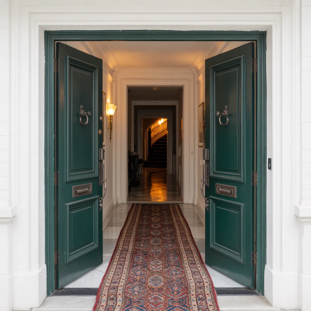
This entryway uses emerald green on the door as the single, high-impact jewel-tone commitment—exactly the kind of strategic move the article highlights for entryways. The rest of the scene stays airy and classic (white trim and bright walls), giving the color plenty of neutral breathing room so it feels elevated rather than overwhelming. Warm lighting inside the hall helps the green read rich and dimensional instead of flat, while the vintage-style runner adds layered pattern and a sense of heritage that supports the “luxurious, timeless” jewel-tone vibe.
The Secret to Making Jewel Tones Feel Timeless (Not Trendy)
The difference between dated and enduring jewel tone designs comes down to three things: restraint, material quality, and thoughtful layering. Start with natural materials—warm wood finishes, textured stone, and burnished brass—alongside your jewel tones.
These create sophisticated depth and prevent color-forward schemes from feeling temporary or magazine-styled. Layer in luxurious textures like velvet, rich fabrics, and metallic finishes; they signal intentional investment in quality rather than experimental decoration.
Thoughtful lighting design is crucial too. Good lighting reveals the complexity and dimensionality in jewel tones throughout the day, whether you’re using natural or artificial light.
Balance strategic jewel tone commitments with substantial neutral zones—this prevents aesthetic fatigue over time and keeps your space feeling fresh years later. Choose classic furniture silhouettes rather than trendy pieces; this ensures your room doesn’t age alongside passing design cycles.
When you invest in superior finishes—high-quality paints with genuine depth and well-constructed upholstered pieces—you’re making a statement about intentional design rather than experimental decoration.
Professional color selection, such as curated options from trusted brands like Benjamin Moore, reflects comprehensive thinking about lighting, fixtures, materials, and spatial arrangement. This multifaceted approach transforms jewel tones from temporary trends into foundational elements of meaningful home environments that age gracefully and maintain appeal across decades.
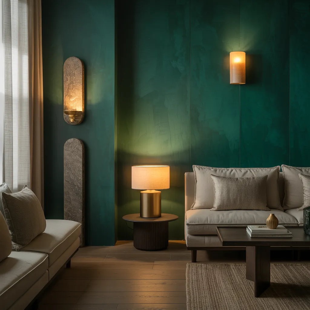
This living room shows “timeless, not trendy” formula in action: the deep teal/emerald wall provides saturated drama, but it’s balanced with substantial neutrals (soft upholstery, light curtains) so the color reads intentional and enduring. The space also leans on texture and material cues—matte/velvety-looking wall finish, woven rug, and warm wood flooring—so the jewel tone feels layered and high-quality rather than purely “color-forward.” Finally, the mix of natural light plus warm lamps/sconces supports what the article stresses about lighting revealing jewel-tone complexity throughout the day.