As trends come and go, certain rug colors that were once popular can start to feel outdated and uninspired. If you’re looking to revamp your space and stay ahead of the curve, it’s time to reconsider some of the hues that have been overused in recent years.
The Colors You Need to Ditch in 2025
As we approach 2025, designers are urging homeowners to bid farewell to certain rug colors that have become overplayed and dated. These hues, once fresh and trendy, now risk making your space feel stuck in the past. It’s time to embrace new, more sophisticated palettes that will breathe life into your interiors. From soft blush pinks to flat beiges, these are the colors that designers want you to avoid in the coming years.
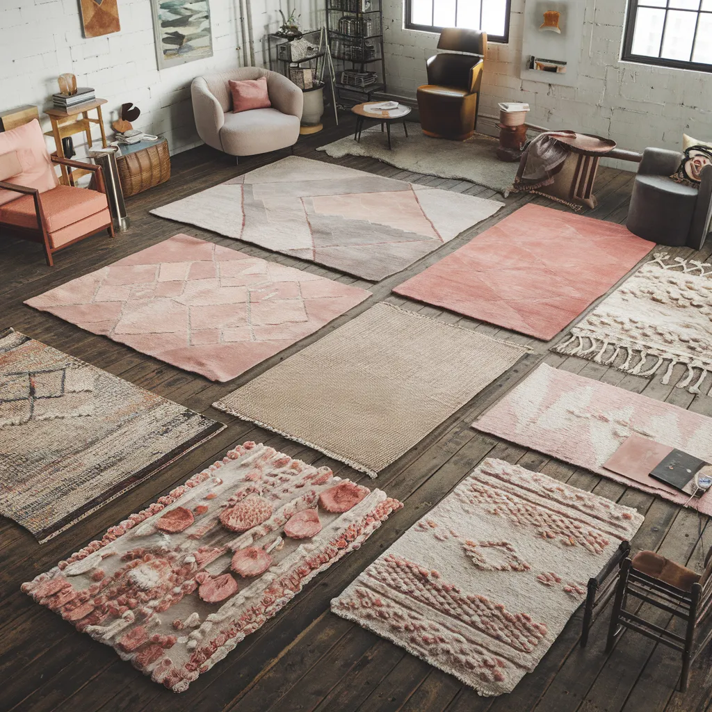
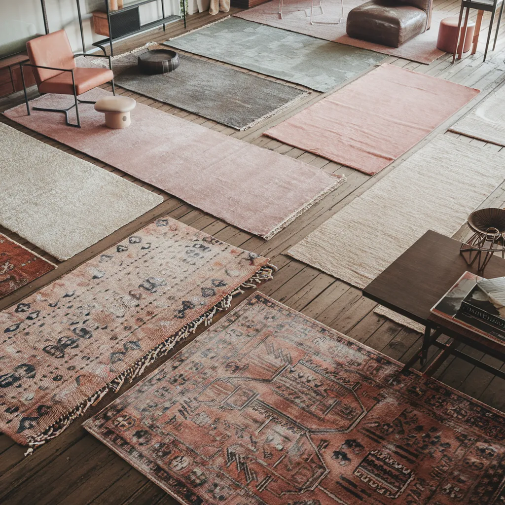
A studio floor becomes a patchwork gallery of artisan rugs: chunky boucle, tonal geometrics and hand-tufted textures in dusty rose, muted terracotta, clay, oatmeal and blush laid over time-worn planks. Eclectic boho-loft styling meets slow-craft aesthetics, revealing how nuanced, earthy reds and neutrals outshine yesterday’s flat pastels. The palette—mauve, sand, clay, blush, raw wool—demonstrates the shift to warmer, grounded hues for 2025 interiors.
Rug Trends: What’s In, What’s Out
As the design world evolves, so too do the trends in rug colors and patterns. While some hues have stood the test of time, others have become victims of overuse, rendering them outdated and in need of a refresh. Designers are now gravitating towards warmer, richer tones that evoke a sense of nature and depth, leaving behind the cool, sterile shades that once dominated. Patterned rugs with a mix of colors are also gaining popularity, offering a more dynamic and timeless look compared to single-hued options.
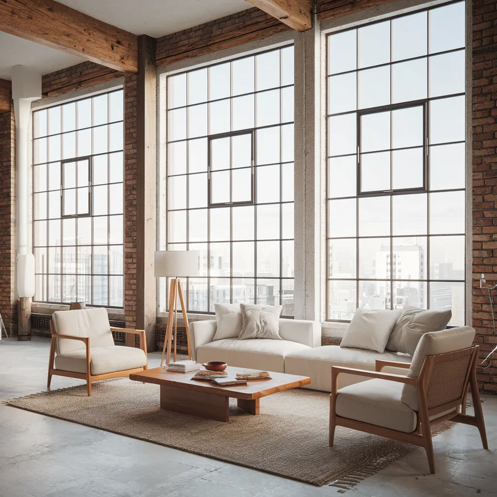
An industrial loft bathed in daylight showcases floor-to-ceiling steel windows, exposed brick and raw beams, softened by a coarse jute rug, low maple coffee table and oatmeal-linen seating. This warm-minimalist, Scandinavian-meets-industrial space leans into the tactile neutrals heralded as fresh—toward sand, taupe, driftwood and natural fibre rather than cool gray. Dominant colors: sun-bleached jute, creamy upholstery, honey wood, brushed bronze accents.
5 Rug Shades Designers Want You to Avoid
- Blush Pink: Once a darling of the design world, soft blush-pink tones have become overused and now feel tied to a specific design moment that has passed. Instead, opt for bolder orange tones or earthier variations like dusty rose, rust, or muted terracotta.
- High Black and White Contrast: Bold high-contrast black and white patterns, especially geometric ones that were popular in boho and Scandinavian styles, now often read as overly graphic or dated. The move is toward softened contrasts like off-white with charcoal or cream with espresso.
- Beige-on-Beige: Flat, blurred beige tones that lack contrast are starting to feel tired and uninspired, especially shades that flatten a space. Adding texture through a short-pile shag or flatweave can upgrade beige from drab to sophisticated.
- Cool Gray Tones: Mid-tone gray has been overused, especially in mass-market and home staging rugs, and now feels sterile and uninspired compared to warmer, richer browns, taupes, clay hues, and neutralized grays.
- Light Nautical Blues: Cool tones like icy blues or minty greens are losing ground as warmer palettes take over. While a coastal vibe can read cliché, there are more sophisticated options like sage, sand, driftwood, and mineral blue over obvious sea blue-and-white pairings.
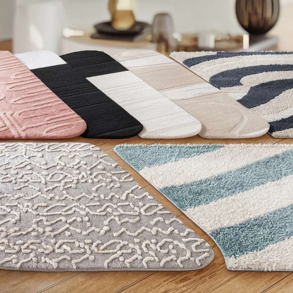
This lineup lays the offenders bare: a series of bath mats in dusty blush, stark black-and-white, flat beige, cool gray and icy navy-and-cream stripes. Shot against neutral hardwood, every swatch echoes a color on the article’s “ditch” list. The tonal spread moves from pale pink through beige and gray to high-contrast monochrome, underscoring how these once-trendy shades can now read sterile or overly graphic.
Is Your Rug Outdated?
If your rug features any of the colors mentioned above, it may be time for an update. While personal preference plays a role, designers agree that these hues have become overused and can make a space feel dated or uninspired. However, that doesn’t mean you need to replace your rug entirely. Sometimes, simply adding a new accent piece or rearranging your furniture can breathe new life into a room. Before making any major changes, take a step back and assess your space objectively. Do the colors feel fresh and inviting, or do they seem to weigh the room down? Trust your instincts, and don’t be afraid to experiment with new color combinations and textures.
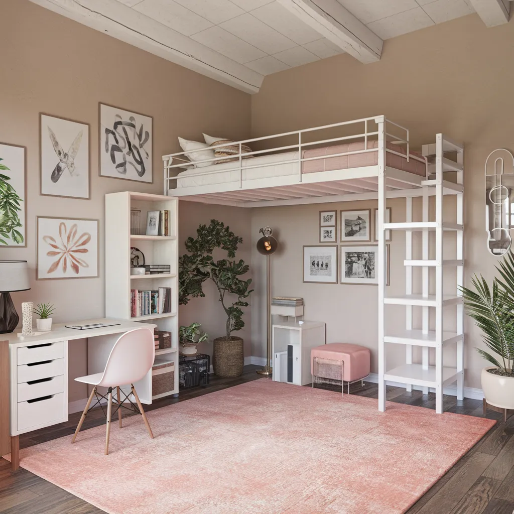
A compact loft bedroom/office pairs a pale blush area rug with a white metal loft bed, slim desk and open shelving against sandy beige walls. Graphic line art, gentle greenery and matte brass lighting add Scandinavian lightness, yet that soft pink floorcovering exemplifies the “blush fatigue” designers now flag as dated. The palette is mostly whisper-soft: blush, warm beige, white and touches of muted sage—an airy modern-Scandi scheme ripe for the deeper, clay-rich tones.
Revamp Your Space: Rug Colors to Reconsider
If you’re ready to breathe new life into your space, consider incorporating some of the rug colors that designers are currently loving. Warm, earthy tones like terracotta, rust, and clay can add depth and richness to a room, while neutrals like taupe, sand, and driftwood offer a more subtle sophistication. For those seeking a bolder look, jewel tones like emerald green, sapphire blue, and amethyst purple can make a statement without feeling overwhelming. And don’t be afraid to mix and match colors and patterns – a well-curated combination can create a dynamic and visually interesting space that feels both current and timeless.
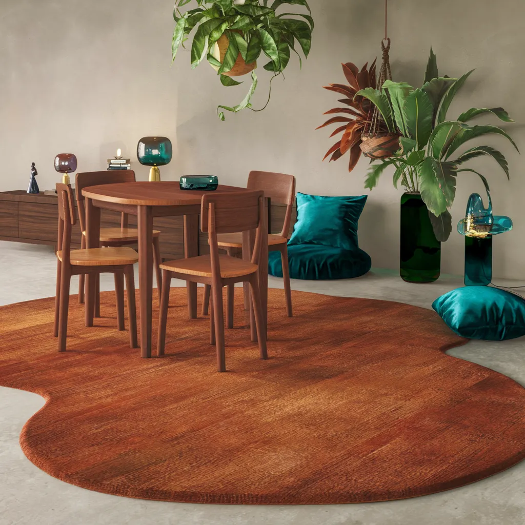
A sculptural burnt-orange rug ripples beneath a round walnut table and chairs, flanked by jewel-toned teal velvet floor cushions, mouth-blown glass lamps and cascades of hanging greenery. The concrete floor, low credenza and clean plaster walls reinforce a warm-minimalist, Mid-Century Modern mood. Dominant hues—rust, walnut brown, teal and lush botanical greens—illustrate the earthy, saturated alternatives that champions over passé blush and beige rugs.