A new trend is emerging that’s causing quite a stir among professionals. It’s a bold, unconventional approach that challenges traditional norms and promises to redefine the way we perceive and experience our living spaces.
The Evolving Art of Contrast: Doors and Trim in 2025
As we look ahead to the design landscape of 2025, a fascinating shift is taking place. Interior designers are breaking free from the conventional mindset of matching door and trim colors, opting instead for a more daring and visually captivating approach. By embracing contrasting hues and textures, they are creating spaces that exude depth, intrigue, and intentional focal points. This newfound freedom is driving a wave of creativity that is both exciting and, for some, a little unsettling.
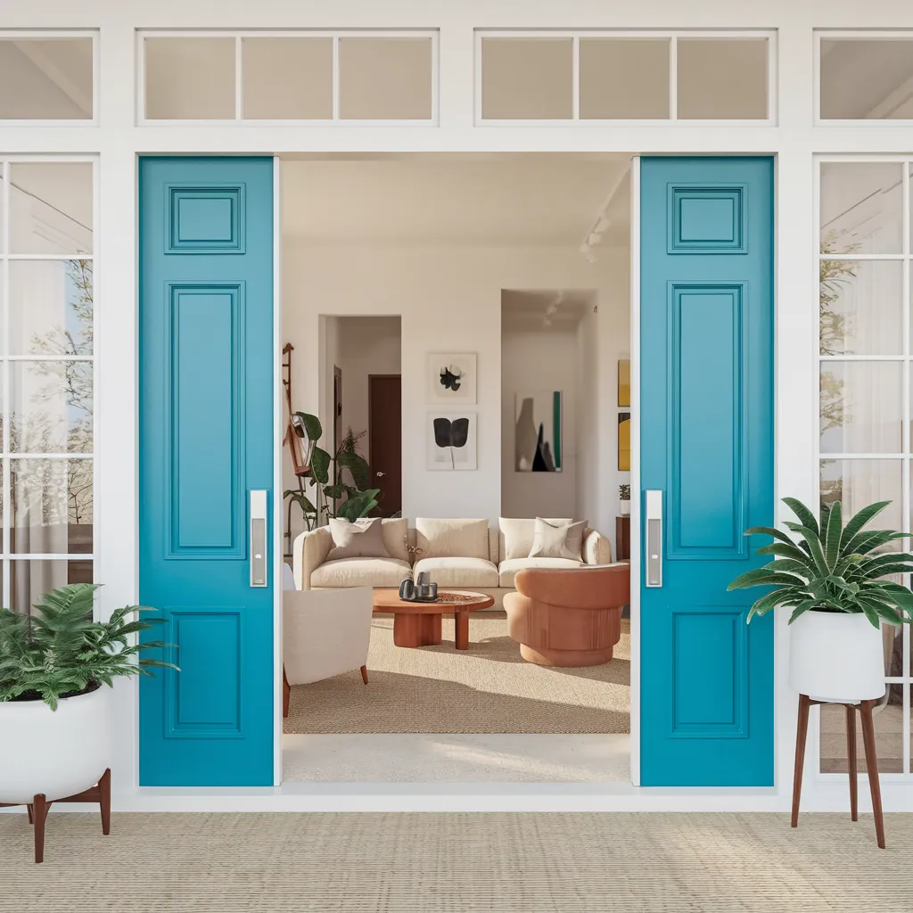
Vivid teal sliding doors open to a bright, modern living room, turning entry millwork into art. Crisp white walls, sandy rug, sculptural tables, and a terracotta lounge chair keep the scene relaxed and sunlit—an easy, coastal-meets-Scandi take. The palette pops yet stays balanced: saturated teal framed by clean white, light oak, oatmeal neutrals, matte black hardware, and fresh plant greens for a welcoming, camera-ready threshold. The door color sets the tone instantly.
Unveiling the Secrets: Should Doors and Trim Match?
For decades, the traditional approach to interior design dictated that doors and trim should be a harmonious match, creating a cohesive and calming envelope within a space. This philosophy was rooted in the belief that millwork, often crafted from similar materials, should blend seamlessly into the overall aesthetic. However, as design evolves, so too do the perspectives on what constitutes visual harmony. A growing number of designers are challenging this notion, arguing that contrast can be a powerful tool for creating depth, definition, and sharpening the architectural elements of a room.
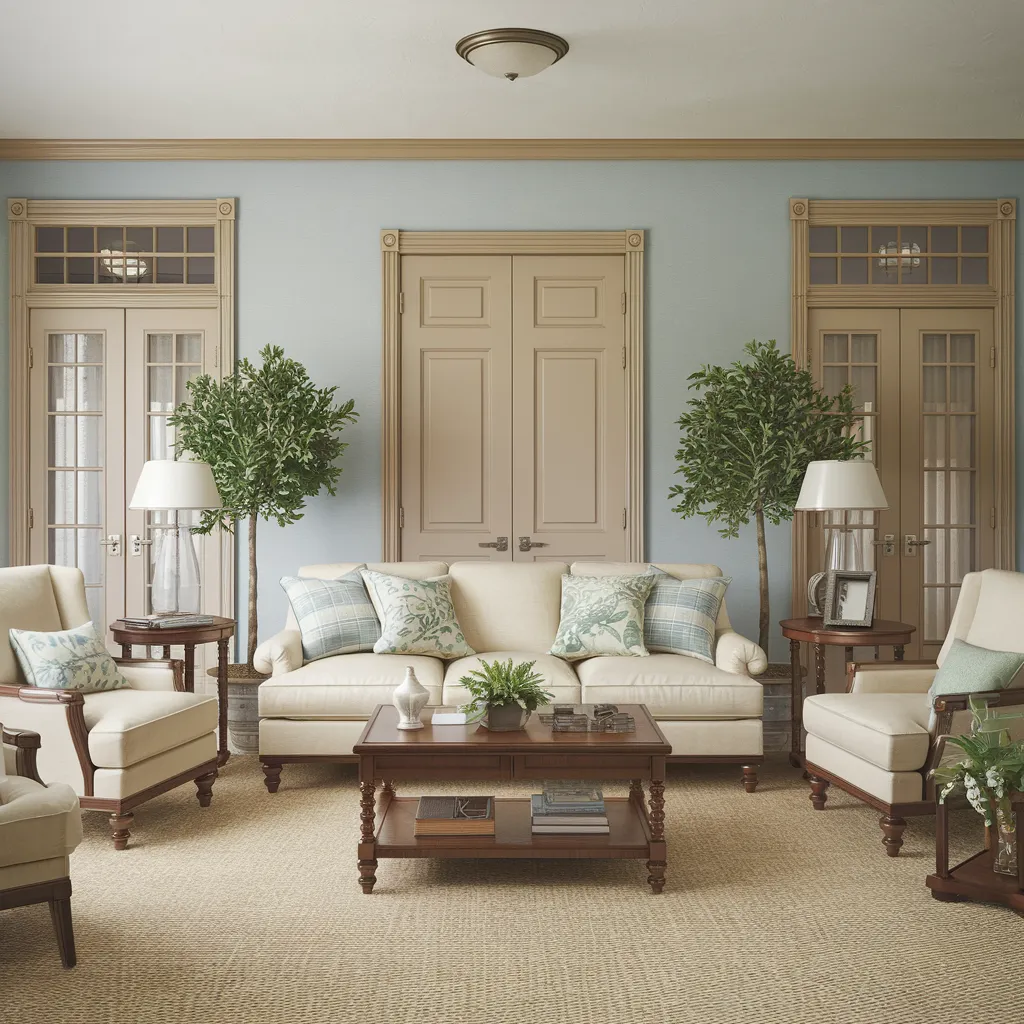
Symmetrical seating and turned-wood tables frame a calm living room where powder-blue walls meet buttery-cream doors and trim. With tailored sofas, pleated lampshades, and botanical accents, the style reads refined traditional with a light cottage note—proof the painted-doors trend isn’t only bold; it can be quietly elevating. Gridded transoms reinforce the classic profile. The palette is serene and coastal-leaning: sky blue, cream, linen, wheat, walnut brown, and touches of sage and eucalyptus green.
Intriguing Ambiguity: The Debate Continues…
As with any shift in design philosophy, the move towards contrasting door and trim colors has sparked a lively debate within the industry. Proponents argue that this approach adds visual interest, creates tension, and allows for bold, unexpected color variations and material textures to take center stage. They believe that by separating doors and trim with contrasting shades, these architectural elements become framing lines that pull focus and anchor the space. On the other hand, traditionalists contend that matching colors create a quiet, intentional envelope that allows the architecture to shine without unnecessary distractions.
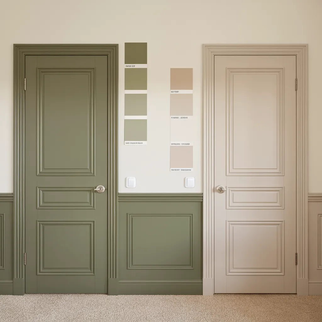
Side-by-side paneled doors spotlight the painted-doors trend: one in muted olive with matching wainscot, the other in warm greige. Vertical swatch strips map options on a creamy wall above crisp millwork and soft loop carpet. The style reads transitional—heritage profiles updated with confident, grounded color. Palette: sage and olive greens, mushroom and taupe greiges, warm stone and ivory, with brushed-nickel hardware—tonal contrast that adds depth while keeping the room calm.
Crafting Visual Harmony: Designers’ Perspectives
As the debate rages on, designers are exploring various approaches to strike the perfect balance between contrast and harmony. Some are embracing bold color statements, using rich, saturated hues or unique tonal variations for doors and trim. While matching these bold colors creates a sculptural, immersive envelope, separating them with contrasting shades builds tension and visual interest. Others are experimenting with interesting materials and curated contrast, pairing warm putty tones, inky charcoals, or natural wood finishes with contrasting trim or door colors. Subtle interest can also be achieved through warm gray doors against off-white trim and walls.
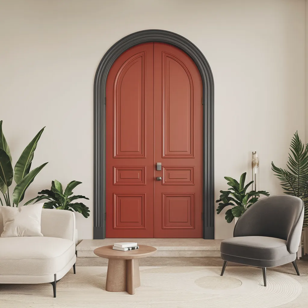
An arched double door painted earthy terracotta with deep charcoal casing anchors a pared-back living area. Rounded seating, pale upholstery, a low wood table, and lush plants nod to contemporary Mediterranean minimalism. This is the trend’s bold-but-livable play: treat the door as sculpture, keep walls warm white, and let trim frame the moment. The palette: terracotta red, graphite, soft ivory, natural oak, muted taupe, and botanical greens—proof a saturated door coexists beautifully with calm neutrals.
Unlock the Possibilities: Your Guide to Intentional Design
Ultimately, the key to mastering this trend lies in having intention and expressing personal style, rather than following strict rules. Designers aim to sculpt perspective, sharpen palettes, and give rooms more visual structure through thoughtful use of door and trim colors. Whether it’s highlighting the architecture by using varying hues of the same color to pick out detailing like beads or trim on panels, or contrasting colors on intricate paneling to draw attention and create a playful look, the possibilities are endless. As this trend continues to gain momentum, one thing is certain: the future of interior design promises to be a captivating exploration of contrast, depth, and intentional design.
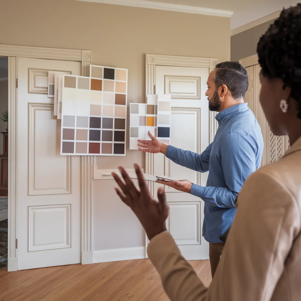
Large swatch boards lean against paneled interior doors, set within classic moulding and warm beige walls. The space is transitional-traditional: crisp millwork, hardwood floors, and understated elegance. Here, the story is testing door and trim color families before committing—a smart step. The palette skews warm and versatile: ivory, cream, greige, mushroom, cappuccino, terracotta-tan, and soft charcoal, ideal for tonal contrast that adds depth without overwhelming.