When it comes to creating a harmonious and visually appealing interior space, the often-overlooked neutral color wheel can be a powerful tool. This unique color guide arranges muted shades like whites, grays, and beiges by their undertones, making it easier to combine complementary tones while avoiding clashes.
The Subtle Power of Neutral Tones
While vibrant hues can make a bold statement, neutral tones offer a sense of timeless elegance and serenity. The neutral color wheel is a visual representation of these soft, muted shades, ranging from warm ivories and tans to cool grays and oysters. At its core, you’ll find true neutrals like white, off-white, and classic gray. Nearly-neutral shades like dusty rose and sage green are sometimes included, adding a touch of subtle color. This carefully curated arrangement highlights the relationships and subtle differences between each shade, making it easier to create cohesive and balanced interior design schemes.
While vibrant hues can make a bold statement, neutral tones offer a sense of timeless elegance and serenity. The neutral color wheel is a visual representation of these soft, muted shades, ranging from warm ivories and tans to cool grays and oysters. At its core, you’ll find true neutrals like white, off-white, and classic gray. Nearly-neutral shades like dusty rose and sage green are sometimes included, adding a touch of subtle color. This carefully curated arrangement highlights the relationships and subtle differences between each shade, making it easier to create cohesive and balanced interior design schemes.
Unveiling the Secrets of the Neutral Color Wheel
The neutral color wheel typically features a warm-to-cool transition, with warm neutrals like ivory and tan on one side, cool neutrals like oyster and graphite on the other, and core neutrals like white, off-white, and gray in the middle. This intentional arrangement takes the guesswork out of combining neutrals by clearly showing their undertones and how they interact. By understanding these relationships, designers can intentionally layer tones, textures, and materials to create depth and visual interest, even in minimalist schemes. Warm neutrals evoke a sense of serenity and timelessness, while cool tones bring a refreshing counterpoint.
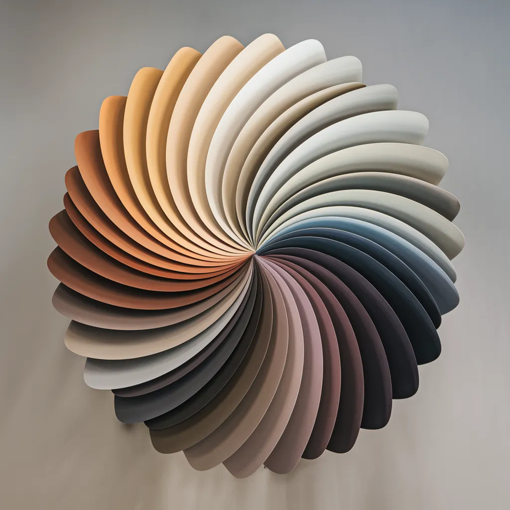
A circular color wheel showcasing neutral hues arranged in a warm-to-cool spectrum. Warm shades like ivory and tan on one side transition smoothly to cool tones like oyster and graphite, with core neutrals like white, off-white, and gray at the center. Contemporary graphic design tool illustrating strategic color combinations for layering textures and materials in minimalist interior palettes. Warm neutrals evoke serenity and timelessness, while cool counterpoints offer a refreshing contrast. The wheel simplifies combining neutral undertones by visualizing their harmonious relationships.
Mastering the Art of Layering Neutrals
To effectively use the neutral color wheel, start by identifying your base neutral as warm or cool, then explore nearby shades on the wheel with similar undertones to incorporate. Introduce gentle contrast with small doses of opposing warm or cool tones. This approach keeps the palette balanced and prevents a flat, one-note look. Variety is key to elevating neutrals – mix different materials like wood, linen, and stone alongside tonal variety. Environmental factors like location can also inform whether to use warm or cool neutrals. Warm tones complement natural settings, while cool grays suit urban spaces.
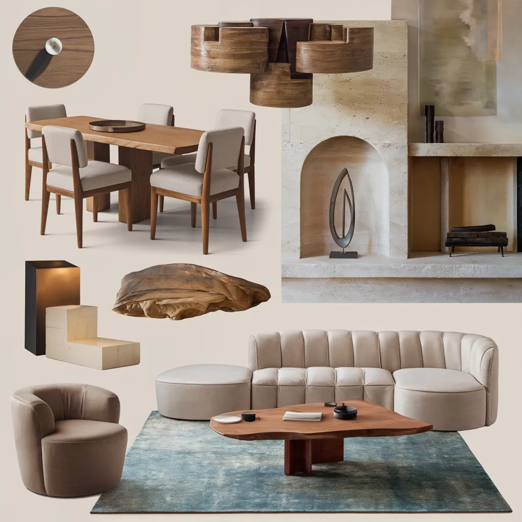
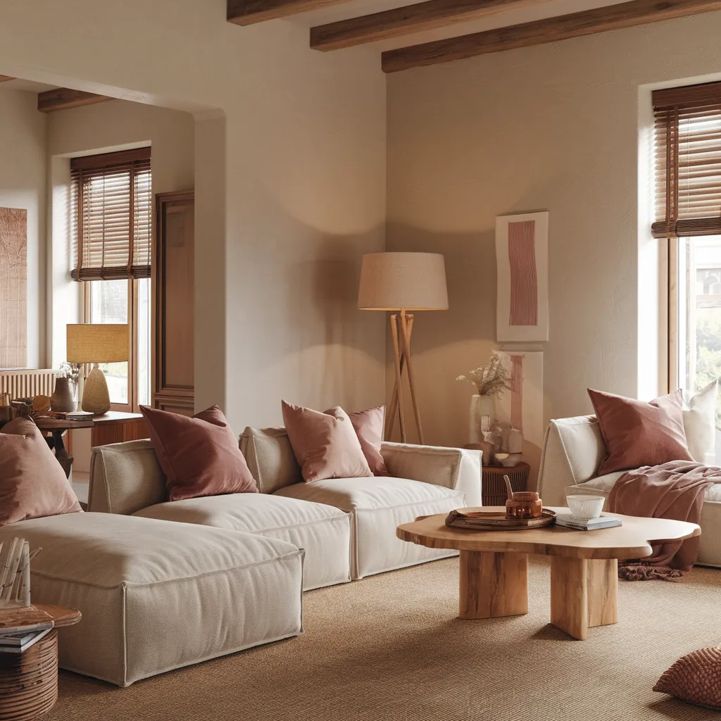
Contemporary collage of a dining area with minimal furnishings and an earthy, nature-inspired palette. Light wood floors, woven chairs, and streamlined oak table seamlessly blend rustic and modern elements. Creamy white walls allow rich terracotta, sage green, and sandy beige accents to pop while maintaining a serene, inviting vibe. Natural textures like jute rugs, clay pottery, and woven textiles add organic warmth.
Warm vs. Cool: The Eternal Neutral Debate
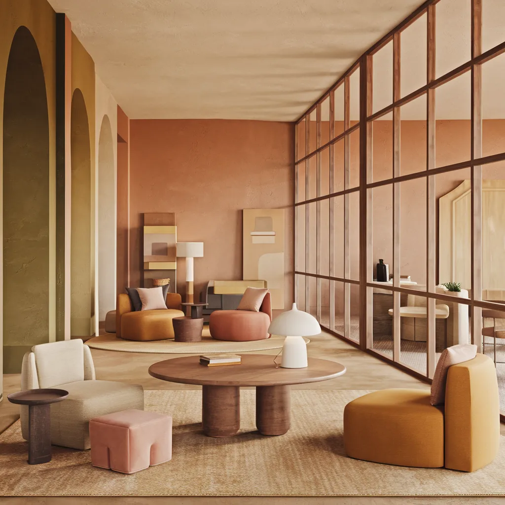
While some designers have a clear preference for warm or cool neutrals, others take a more open-minded approach. For example, consider mildly saturated shades like olive, peach, and mustard as ‘color-neutrals’ that can create inviting, sunny environments. These shades add a touch of warmth and personality without overwhelming the space. Ultimately, the choice between warm and cool neutrals comes down to personal preference and the desired atmosphere. Warm tones evoke a cozy, welcoming feel, while cool tones offer a sense of crispness and sophistication.
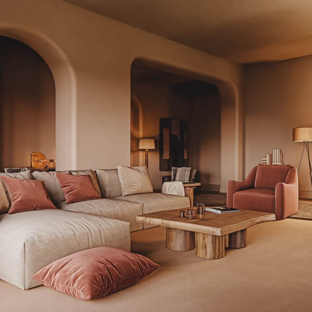
Warm earth tones and natural textures create an inviting living space with rustic appeal. A plush tan sofa with casual linen upholstery anchors the room, complemented by terracotta-colored ceramic accent tables and a textured jute area rug. Oak wood elements, including the exposed ceiling beams and coffee table, introduce organic lines and contrast against the crisp white walls. Dried botanicals and woven baskets heighten the earthy, bohemian aesthetic that celebrates natural materials and artisanal craftsmanship.
Elevating Neutrals: From Flat to Fabulous
By understanding the nuances of the neutral color wheel, designers can elevate these often-overlooked shades from flat and boring to fabulous and sophisticated. The key is to intentionally layer tones, textures, and materials, creating depth and visual interest. Incorporate a mix of warm and cool neutrals, balancing them with pops of contrast and texture. Experiment with different materials like wood, linen, and stone to add dimension and richness. And don’t be afraid to introduce small doses of nearly-neutral shades like dusty rose or sage green for a touch of subtle color. With the neutral color wheel as your guide, you can create interior spaces that exude timeless elegance and serene sophistication.
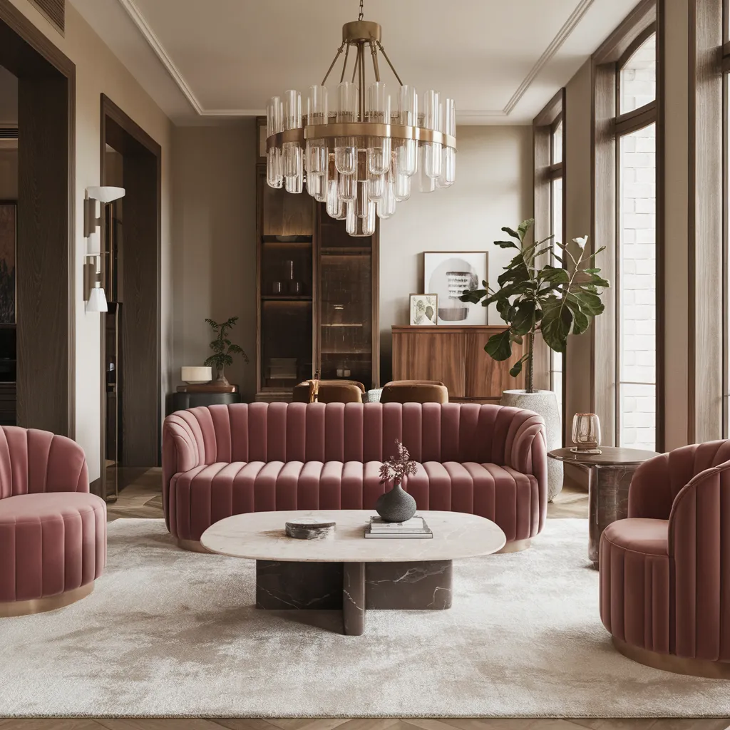
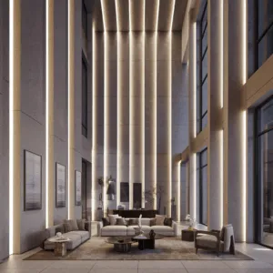
Elegant neutral living room with plush sofa, wood accents, and soft textural elements. Scandinavian minimalist style featuring oak furniture, linen upholstery, and ceramic decor in a palette of warm beiges, cool grays, and black accents. Contrasting textures of smooth wood, nubby linen, and sleek metal create visual depth and interest.