As we look ahead to 2026, the world of kitchen design is embracing a fresh wave of color trends that draw inspiration from the natural world. These hues not only infuse our culinary spaces with warmth and character but also reflect our growing desire for tranquility and connection with the great outdoors.
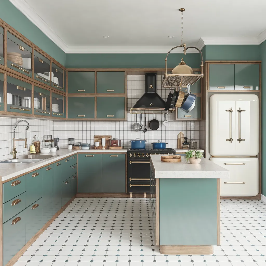
Teal Tones: The Moody Yet Adaptable Kitchen Color Trend
Teal, a rich and moody shade of blue-green, is poised to make a bold statement in kitchens across the nation. This versatile hue, reminiscent of the deep waters of a tranquil lake, offers a sense of serenity and sophistication. Designers are gravitating towards deeper, slightly smoked teal tones that deliver mood without heaviness. Teal’s adaptability is one of its greatest strengths, as it can seamlessly blend with warm whites, pale terrazzo or off-white quartz countertops, oak accents, and brass, brushed nickel or matte black hardware. Whether used on slab cabinetry or modernizing Shaker doors, teal promises to elevate any kitchen with its timeless allure.
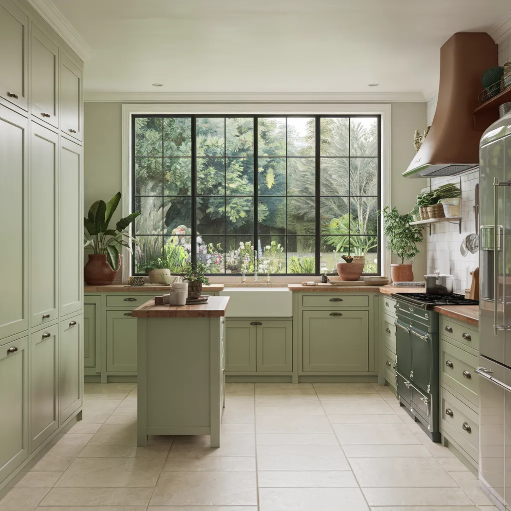
Herbal Greens: Grounding Shades for a Calming Culinary Oasis
In a world that often feels chaotic, homeowners are seeking solace in the soothing embrace of nature. Softer green shades like sage, olive, eucalyptus, and moss are taking over from the moodier khakis and forest greens of the past. These herbal tones, reminiscent of a lush garden oasis, exude a sense of calm and groundedness. They excel on full-height cabinets, islands, and appliance walls, particularly when paired with matte or lightly grained wood finishes that absorb light softly. These earthy hues create an upscale and serene atmosphere, inviting you to slow down and savor the simple pleasures of cooking and gathering with loved ones.
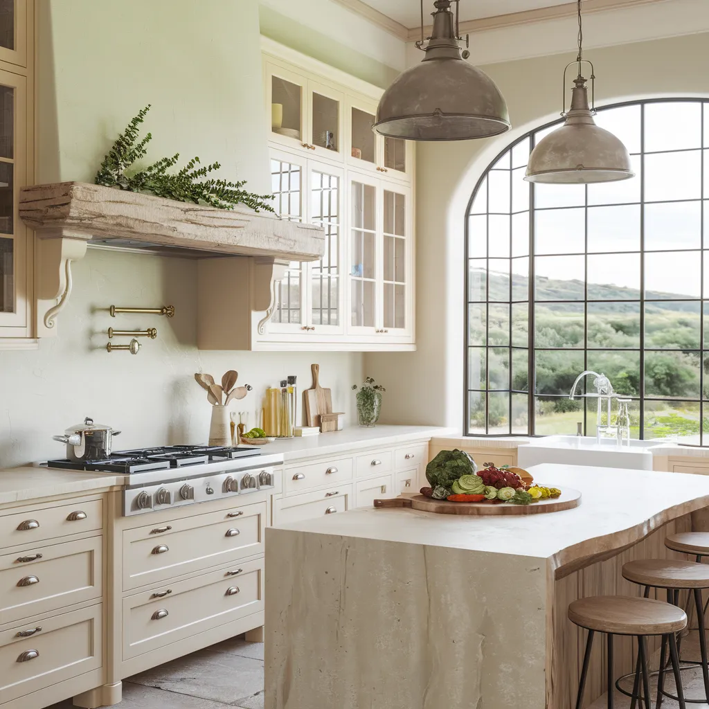
The New Neutrals: Pale Beiges and Greiges with Character
While classic neutrals like stark whites and grays have long been a staple in kitchen design, 2026 is ushering in a new era of character neutrals. Complex pale beiges and greiges with subtle green, taupe, or red undertones are becoming the new go-to shades. These hues offer softness, architectural clarity, and flexibility when paired with rough woods, matte lacquers, sculptural worktops, and metal accents. Unlike their predecessors, these character neutrals possess depth and warmth, creating a welcoming and inviting atmosphere. They serve as a versatile canvas, allowing homeowners to experiment with bold accents and textures while maintaining a cohesive and harmonious overall aesthetic.
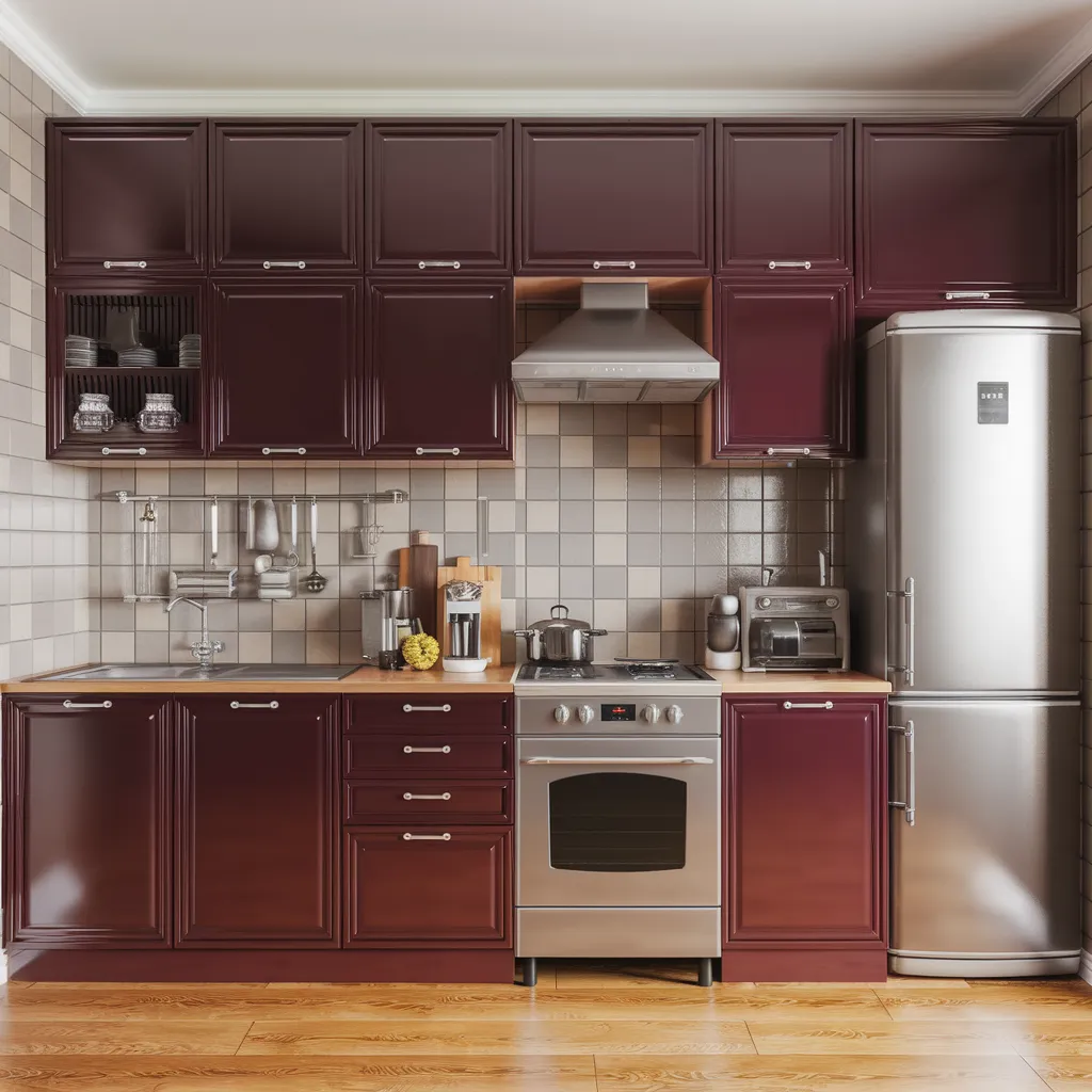
Burgundy Hues: Bringing Warmth and Richness to the Kitchen
After years of avoidance, deeper reds like wine tones and violet-tinged browns are emerging as a bold and unexpected choice for kitchen design. These rich, burgundy hues bring warmth and richness to the space, creating an atmosphere of intention and atmosphere. While they may seem daring at first, these shades behave like dark neutrals, allowing them to seamlessly blend with contemporary stones, ceramic textures, and brushed metals. Whether used on cabinetry, islands, or accent walls, burgundy tones add depth and sophistication, transforming the kitchen into a cozy and inviting gathering place.
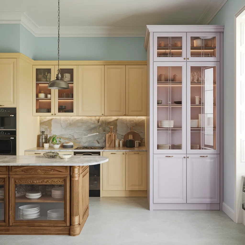
Quiet Pastels: Subtle Supporting Players for a Harmonious Space
While bold hues may steal the spotlight, quiet pastels are emerging as the unsung heroes of kitchen design in 2026. Pale blues, butter yellows, and soft lilacs are the new supporting players, adding subtle color without overwhelming the space. These delicate shades, when used on walls, backsplashes, or pantries, blend quietly and complement bolder hues, creating a harmonious and balanced aesthetic. Pastels offer a sense of tranquility and softness, making them the perfect choice for those seeking a serene and calming culinary oasis.