Most homeowners unknowingly sabotage their wall art displays by placing them in the wrong spots. Bathrooms with high humidity, sunny windowsills, and spots above active fireplaces create harsh environments that damage artwork and fade colors over time. High-traffic areas pose another challenge—vibrations from footsteps can loosen hanging hardware and shift your carefully arranged pieces.
But placement is only half the battle. Cluttered shelves, overflowing surfaces, and disorganized décor around your art actually diminish its impact. Think of wall art like a focal point—when everything around it competes for attention, the piece loses its power. Clean, intentional spacing lets your artwork shine.
Lighting matters too. Artwork displayed in dim corners or in direct glare won’t look its best. Gallery professionals know that thoughtful curation means considering not just where art hangs, but how its surroundings either enhance or undermine what you’re displaying. The sweet spot? Placing art away from humidity and extreme heat, keeping nearby surfaces organized, and ensuring adequate—but not harsh—lighting.
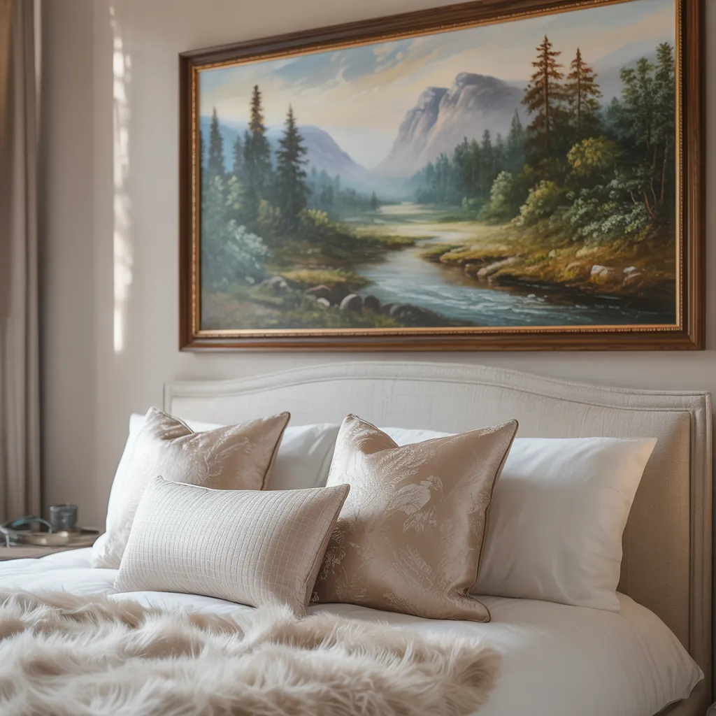
Bedroom Art Size: Why Bigger Isn’t Always Better
Oversized artwork above your bed can actually make the room feel smaller and more cramped. Proportions matter enormously in intimate spaces like bedrooms. Design professionals typically recommend that bedroom art occupy about 50-75% of your headboard width rather than matching it entirely. This creates visual breathing room while still making a statement.
Here’s why scale matters: when artwork feels too large, it psychologically compresses the space and creates visual tension—the opposite of what you want in your personal retreat. Your bedroom should feel calm and inviting, not dominated by a single piece that demands all your attention.
Think of your bedroom as a composed whole rather than a single focal point. Let artwork harmonize with complementary elements like mirrors, textured accents, or small sculptural objects. When everything works together with intentional spacing, your bedroom transforms from visually chaotic to thoughtfully curated—exactly the sophisticated, peaceful sanctuary you deserve.
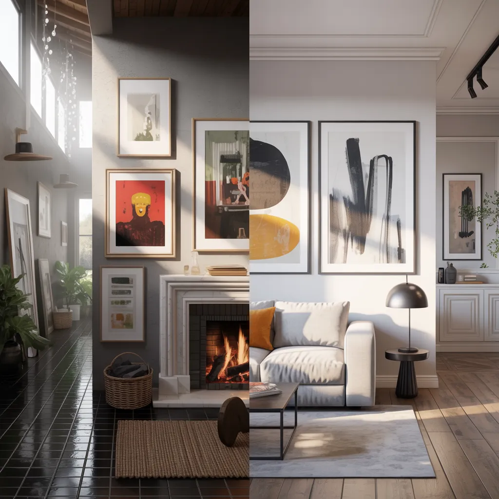
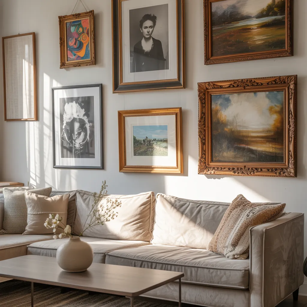
Gallery Walls: Creating Visual Interest Beyond Single Pieces
Gallery walls are where wall art gets really fun. Instead of hanging one large piece, you arrange multiple artworks—different sizes, frame finishes, and even non-traditional elements like mirrors or ceramics—to create visual depth and personality that a single piece can’t achieve.
What makes gallery walls so effective? They tell stories. They showcase collections. They invite people to explore your design choices. You get visual rhythm through varied sizes and spacing, and you can mix different frame finishes and art styles while keeping everything feeling intentional.
The practical benefits are equally appealing: if one piece gets damaged, you simply swap it out instead of disrupting the entire display. This makes gallery walls economical and perfect for renters or anyone who likes to refresh their décor seasonally.
Pro tip: Gallery walls work beautifully in living rooms, hallways, bedrooms, and offices. Start with a layout you love (sketch it out or use painter’s tape to test it), then hang with confidence. When your gallery wall complements your room’s broader design—connecting to furniture, accent colors, and existing décor—it becomes an anchor for the entire space.
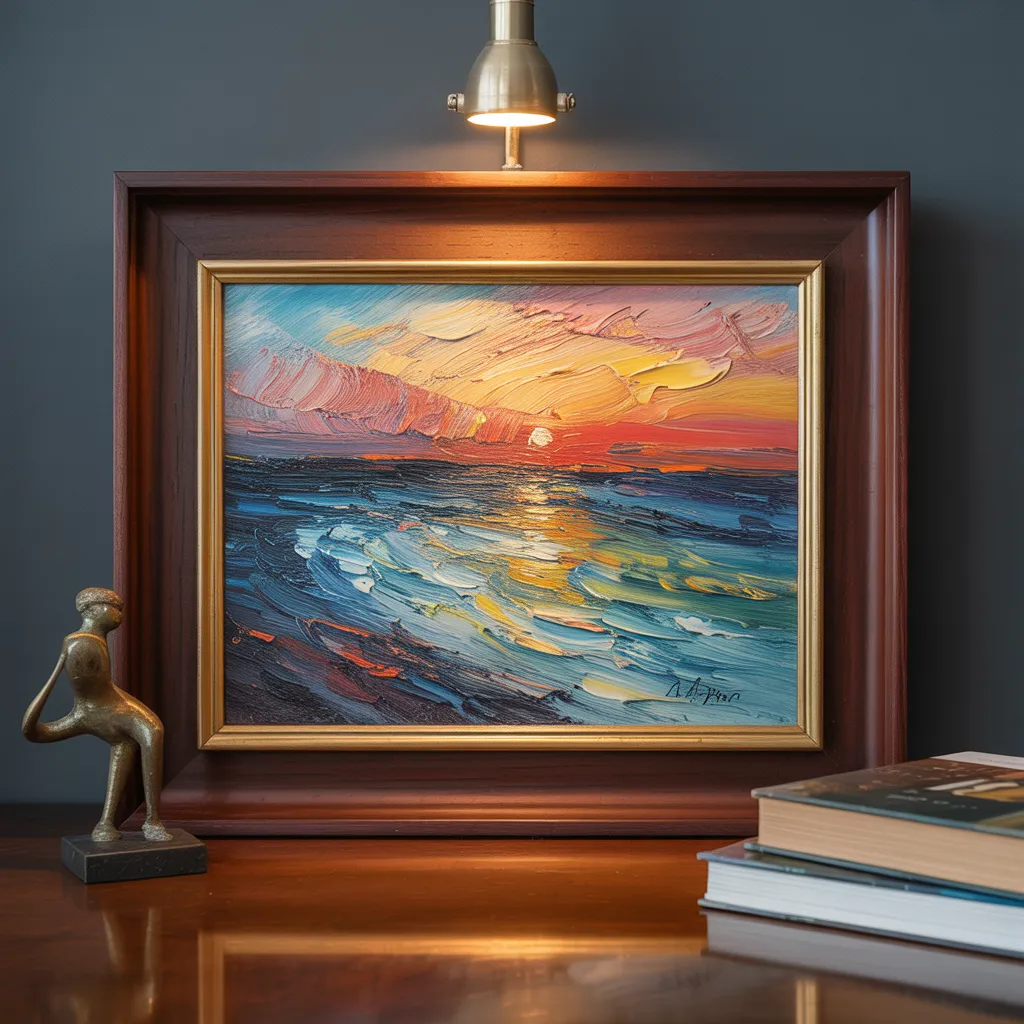
Picture Lights and UV Glass: Professional Preservation Techniques
Here’s what interior designers and museums know: picture lights and UV-protective glass are game-changers for displaying art beautifully and protecting it from damage.
Picture lights direct focused illumination across your artwork, revealing details and texture that disappear under regular room lighting. They’re subtle, use minimal energy, and instantly elevate even modest pieces to gallery-quality displays.
UV-protective glass acts like invisible armor, filtering harmful ultraviolet rays that fade colors and degrade materials over time. This is especially important for artwork in rooms with windows or bright natural light.
Together, these tools create a preservation system that protects your investment while enhancing visual impact. Hotels, museums, and high-end homes use them consistently because they work. Your cherished artwork deserves similar care. When you combine proper lighting and UV protection with surrounding décor that’s equally intentional—curated accessories, complementary colors, thoughtful spacing—you create a sophisticated environment that honors both the art and your design vision.
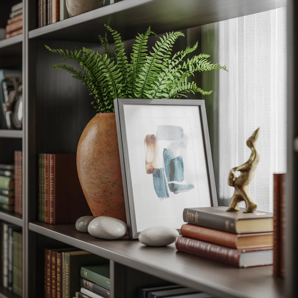
The Leaning Trick: Flexible, Curated-Looking Art Display
Here’s a technique interior designers love: leaning framed artwork on shelves instead of hanging them on walls. It’s flexible, it looks intentional, and it solves real problems—especially in high-traffic areas or for renters concerned about wall damage.
Leaned artwork feels collected and editorial rather than formally installed. You can easily rotate pieces seasonally, experiment with different arrangements, or temporarily remove artwork without leaving holes. Perfect if you move frequently, love switching things up, or live in a rental.
Making it work: The key is keeping surrounding shelving purposefully organized. Leaning art surrounded by clutter loses its impact. Instead, create editorial moments by displaying selective, statement pieces—think a framed print leaning against a plant, next to a favorite book or sculptural object—rather than crowding shelves with everyday items. This disciplined approach transforms leaned artwork into sophisticated focal points that reward your thoughtful curation.