For decades, neutral kitchens dominated design magazines and homeowner dreams, promising timeless elegance. But something fundamental has shifted. In 2026, bold colors—teal, herbal greens, and burgundy—are finally stealing the spotlight from safe, predictable palettes.
And it’s not just a trend; it reflects how designers now think about color itself.
Here’s the truth: color is a powerful design tool that genuinely affects how we think, feel, and experience a space. Bold color choices communicate confidence and sophistication. What was once considered risky is becoming the standard.
Dark, moody tones like Railings by Farrow & Ball (that deep charcoal with blue undertones) create real intimacy and sophistication—without the cramped feeling designers used to worry about. The real shift goes deeper than aesthetics.
Contemporary kitchen design has moved from rigid matching rules to a holistic, layered approach that embraces multi-color cabinet combinations and mixed finishes. This creates visual depth and personality. Color works psychologically, too.
When thoughtfully applied, different colors create distinct moods—some evoke calm, others cheerfulness, comfort, or drama. The conversation has finally evolved from ‘Will this color feel dated?’ to the more honest question: ‘Does this choice reflect intention and vision?’
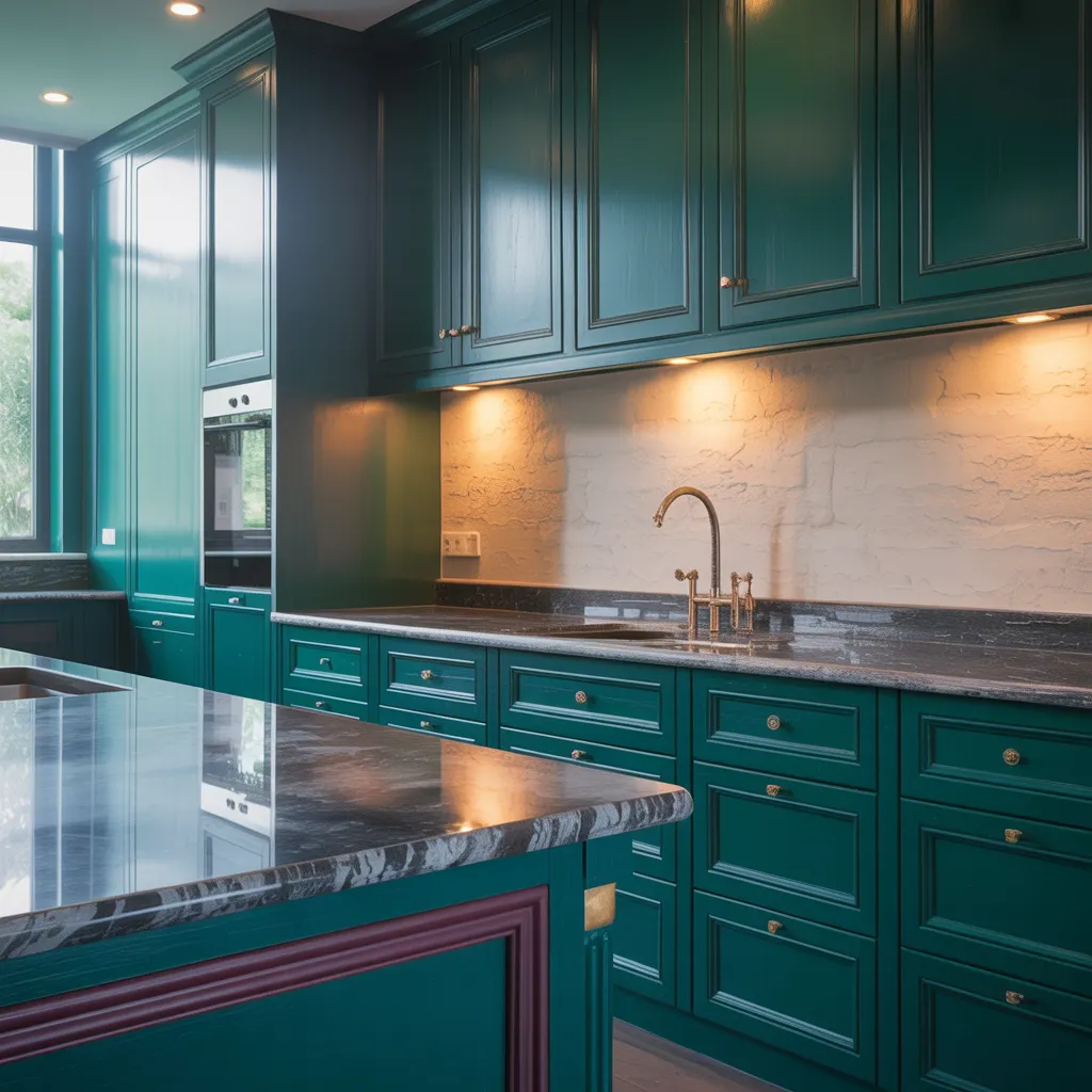
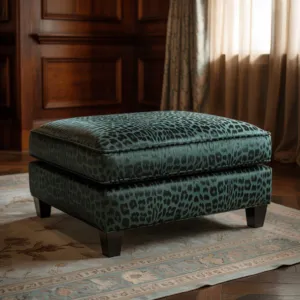
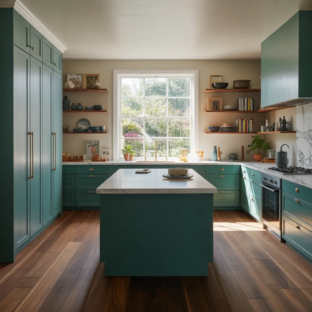
This deep teal kitchen shows exactly why bold color is replacing safe beige. The saturated cabinetry, dark stone, and brass accents create a moody, high-design look that feels confident rather than overwhelming.
Don’t Fear Color – Embrace It
Here’s what might surprise you: pale beiges and greiges aren’t going anywhere. They’re just being reimagined with real purpose.
Mocha tones, quiet pastels, and white kitchens are making sophisticated comebacks—but with intentional design thinking behind them, not defaulting to autopilot selections. The real shift? Fresher palettes and textured finishes that reflect personalized, layered design.
Color harmony isn’t just artistic theory—it’s psychology. Colors positioned together create pleasing or jarring responses depending on how they’re composed.
Today’s designers approach color coordination as both emotional and strategic, recognizing that how we respond to colors depends on lighting, cultural context, and individual preference. Here’s what separates timeless design from regrettable choices: it’s not the color itself, but the conviction and strategy behind it.
Even neutral tones require thoughtfulness about undertones, material coordination, and how light plays through the space at different times of day.
The designers thriving today deliberately select and layer colors—choosing warm hues that advance visually and stimulate, or cool tones that recede and calm. They understand that context always influences how color feels in a space.
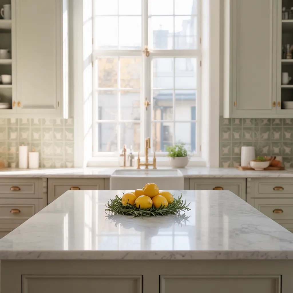
This space proves that lighter kitchens still work when they feel considered. Soft neutrals, pale green tile, and warm brass details give the room freshness and personality without losing the calm, timeless appeal many homeowners still love.
The Mistakes That Reveal What Really Matters in Kitchen Design
Here’s something professional designers consistently see: poor spatial layouts, suboptimal material choices, and cabinetry problems. But here’s the uncomfortable truth—these aren’t random mistakes. They’re symptoms of defaulting to outdated formulas without any real vision.
The real culprit isn’t taking bold color risks. It’s the complete lack of intentionality behind the choices. When kitchens fail, it’s rarely because the color was ‘too brave.’ It’s because there was no clear vision. When you understand color psychology, this becomes obvious: certain colors can overstimulate or feel stressful depending on the environment.
Poor color coordination creates spaces that feel incoherent instead of intentional. Consider the 2024 ‘Unexpected Red Theory’ trend on social media—red accessories everywhere. But success depends entirely on strategic implementation, not just adopting the trend.
The real differentiator? Whether designers carefully considered complementary materials, undertone complexity, and intentional pairings.
Did they layer colors and finishes thoughtfully, creating warmth without heaviness? This distinction fundamentally changes how you should approach renovations. Cohesive color coordination—informed by color theory—transforms spaces from surface-level selections into purposeful environments.
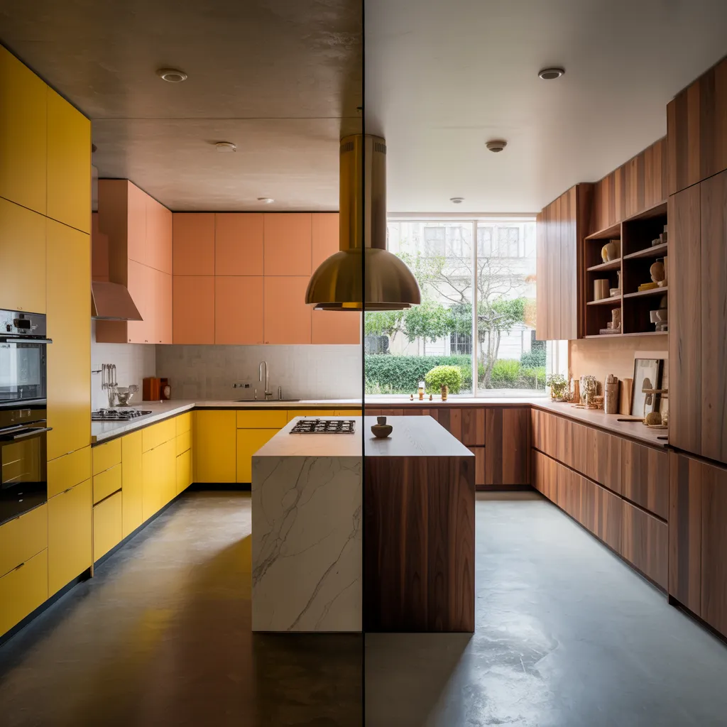
This side-by-side look captures two successful ways color can transform a kitchen: one playful and bold, the other warm and grounded. Strong design is less about following one palette and more about building a cohesive vision around color, tone, and material.
Why Lighting, Layout, and Color Finally Work Together
The 2026 kitchen revolution isn’t just about daring paint colors. It’s about confident choices that reinforce each other across every design element.
Teal cabinets paired with thoughtfully designed lighting aren’t risky experimentation—they’re refined sophistication. Herbal greens succeed when supported by intentional material selections, complementary finishes, and smart layout choices that maximize visual impact.
Think about combinations like London Clay or Railings paired with marble, brass, and natural woods—these create real visual depth and warmth. Even mixed metal finishes produce sophisticated results when tone and balance are considered carefully.
Color theory explains why this integration matters: warm colors advance and stimulate visually, while cool colors recede and calm. Understanding this lets designers strategically position colors throughout kitchens for maximum effect.
Color harmony principles—whether using complementary schemes (creating visual tension) or analogous combinations (creating cohesive experiences)—ensure everything feels connected. Even ceiling colors now matter as part of the overall scheme, affecting ambiance and spatial perception.
Black and white are reliable partners with almost any colors: black decreases the apparent intensity of paired colors, while white showcases all hues equally.
The ultimate truth? Breaking conventional rules works brilliantly when every decision reinforces a cohesive vision. The kitchens capturing attention in 2026 feature color, materials, lighting, and layout creating harmonious conversations rather than isolated bold choices that contradict everything else.
With blue-green cabinetry, open shelving, and natural light, this kitchen shows how color can feel both energizing and serene. It’s a strong example of how cooler tones recede visually while still adding richness, depth, and personality to the room.
How to Tell If Your Kitchen Is Courageous or Just Confused
The line between design inspiration and disaster comes down to one question: Are your choices intentional and strategically connected?
A burgundy kitchen succeeds when paired with complementary materials and lighting that enhances the color throughout the day. That same color fails when it exists in isolation, contradicting other design elements.
Here’s why some homeowners embrace 2026 trends successfully while others regret choices immediately: intention, cohesion, and clear vision matter far more than the color itself. Color genuinely affects how we think and feel in a space.
Dark colors in smaller kitchens create intimacy and ambiance—they don’t cramp spaces like traditional wisdom suggested. That’s how thoughtful implementation transforms perceived limitations into design strengths.
The designers leading this revolution understand something important: breaking from safe, conventional choices—when executed thoughtfully with personal conviction rather than trend-chasing—creates fresh, intentional spaces that feel genuinely yours.
Context always influences color perception, meaning successful bold choices acknowledge your lifestyle, individual preferences, and how you actually use the space. The kitchens that feel courageous rather than confused have a deliberate color philosophy.
Every hue, material pairing, lighting decision, and layered finish reinforces a cohesive vision that feels both visionary and timeless. That’s the real difference between a kitchen that impresses and one you’ll love living in for years.
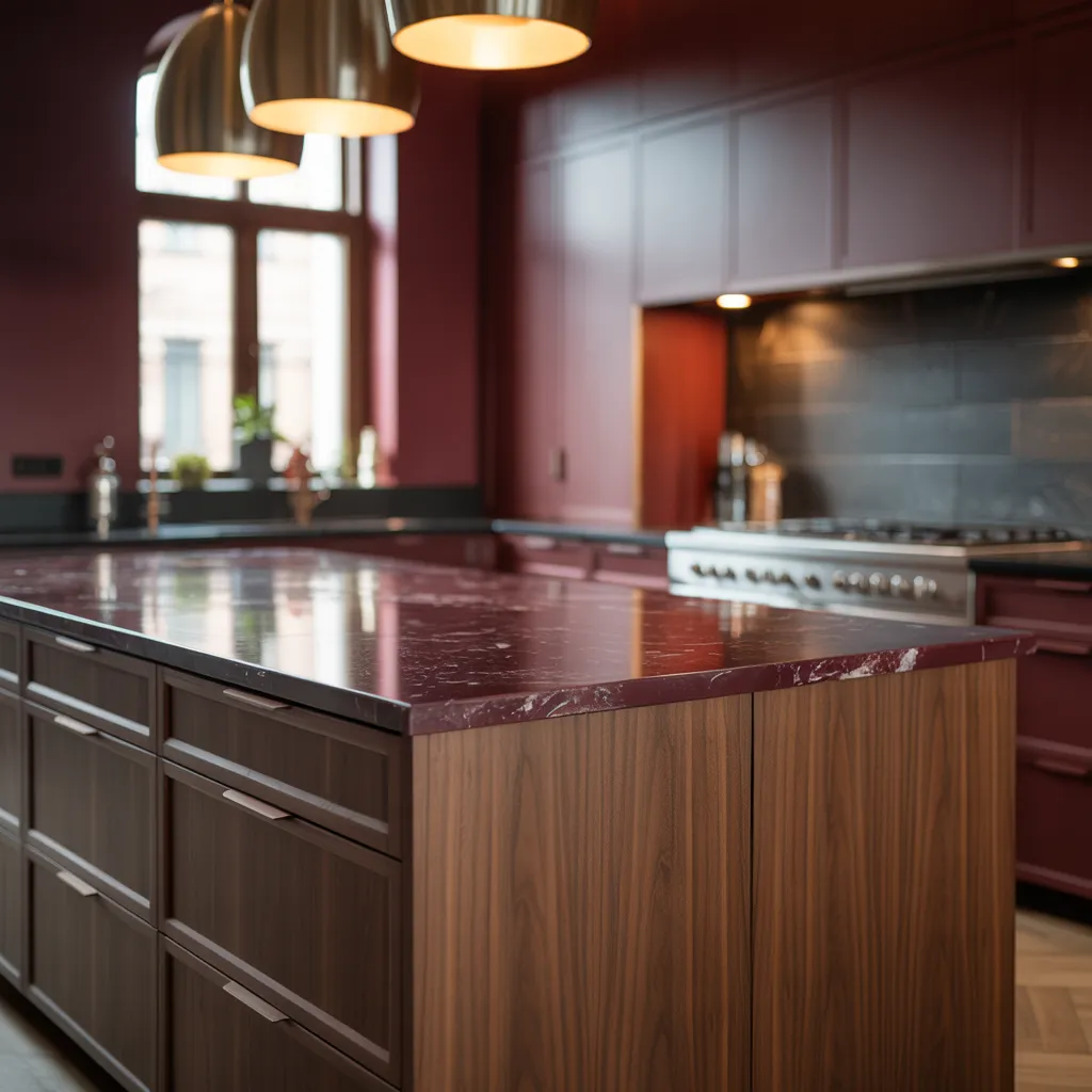
This burgundy kitchen leans into drama in the best possible way. Paired with walnut cabinetry, dark counters, and warm pendant lighting, it shows how richer shades feel elevated when every element works together instead of competing for attention.