Unlock the transformative power of color to create an illusion of expansiveness within your home. Explore the captivating hues that interior designers swear by to visually stretch the boundaries of any room.
The Subtle Magic of Pale Pinks: Unlocking Spatial Clarity
Pale pinks, ranging from delicate blushes to powdery hues, possess a unique ability to infuse spaces with a sense of airiness and clarity. These soft, understated tones offer a refreshing alternative to stark whites or flat beiges, reflecting light gently while maintaining a cozy ambiance. Even the faintest hint of pink breathes life into a room, lending it a warm and inviting character that transcends the sterility of traditional neutrals. From chalky terracotta shades with a rosy undertone to the palest of pinks, these hues create an illusion of expansiveness without sacrificing comfort or personality.
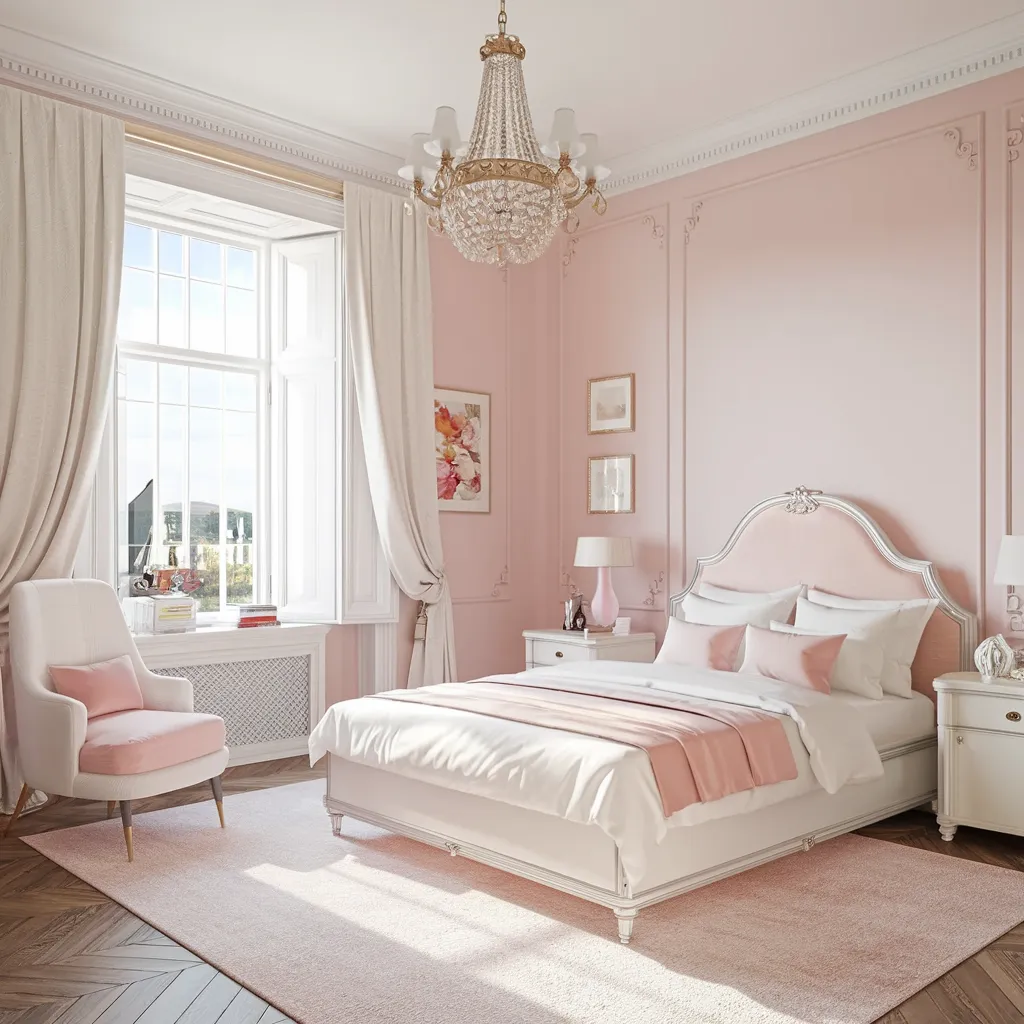
A serene bedroom layers powder-pink walls with white crown, an upholstered bed, gauzy curtains, and light wood herringbone floors—soft minimalism with a romantic twist. Palette: blush and ballet pinks, warm white, champagne metallics, and natural beige. The whisper-light tint keeps surfaces luminous and low contrast, letting edges blur so the ceiling reads taller. Airy textiles and a pale rug extend the footprint, making the retreat feel spacious and calm.
Radiant Yellows: Illuminating Interiors with Warmth and Openness
Embrace the radiant energy of yellow hues to infuse your living spaces with a sense of warmth and openness. Contrary to popular belief, rich yellows can be used in compact areas without making them appear smaller or darker. In fact, these vibrant shades react beautifully with natural light, bouncing it around the room and creating an airy, expansive atmosphere. Whether you opt for a sunny buttercream or a bold mustard, yellow has the power to visually elongate and widen dimensions, making even the coziest nooks feel inviting and spacious. Strategically placed accents or a statement wall in a golden hue can work wonders in transforming the perception of a room’s size.
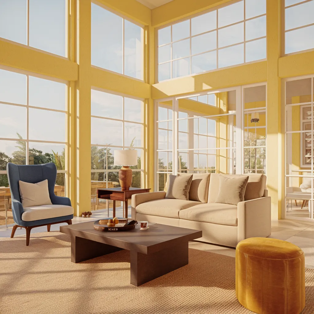
Bathed in sun, this lounge stacks walls of windows against buttery yellow surrounds, a beige sofa, camel textiles, and a sculptural blue accent chair—contemporary with mid-century notes. Palette: soft daffodil, cream, caramel, walnut, and a navy pop. Cheerful, light-reflective yellow carries brightness deep into the room, and pale neutrals keep contrast gentle so corners dissolve. The result is a buoyant, visually expanded envelope that feels open from morning to golden hour.
Verdant Vibrancy: How Bold Greens Blur Indoor-Outdoor Boundaries
Contrary to popular belief, bold shades of green can be a powerful ally in visually expanding the dimensions of a room. When used strategically, these verdant hues possess the ability to blur the boundaries between indoor and outdoor spaces, creating an immersive and expansive experience. Particularly in rooms with a view of trees or foliage, vibrant greens seamlessly integrate the natural surroundings, making the walls appear to recede and the space feel larger than its physical confines. For an even more dramatic effect, consider employing the technique of ‘color capping’ by painting the ceiling in a lighter shade of green, further enhancing the illusion of boundless space above.
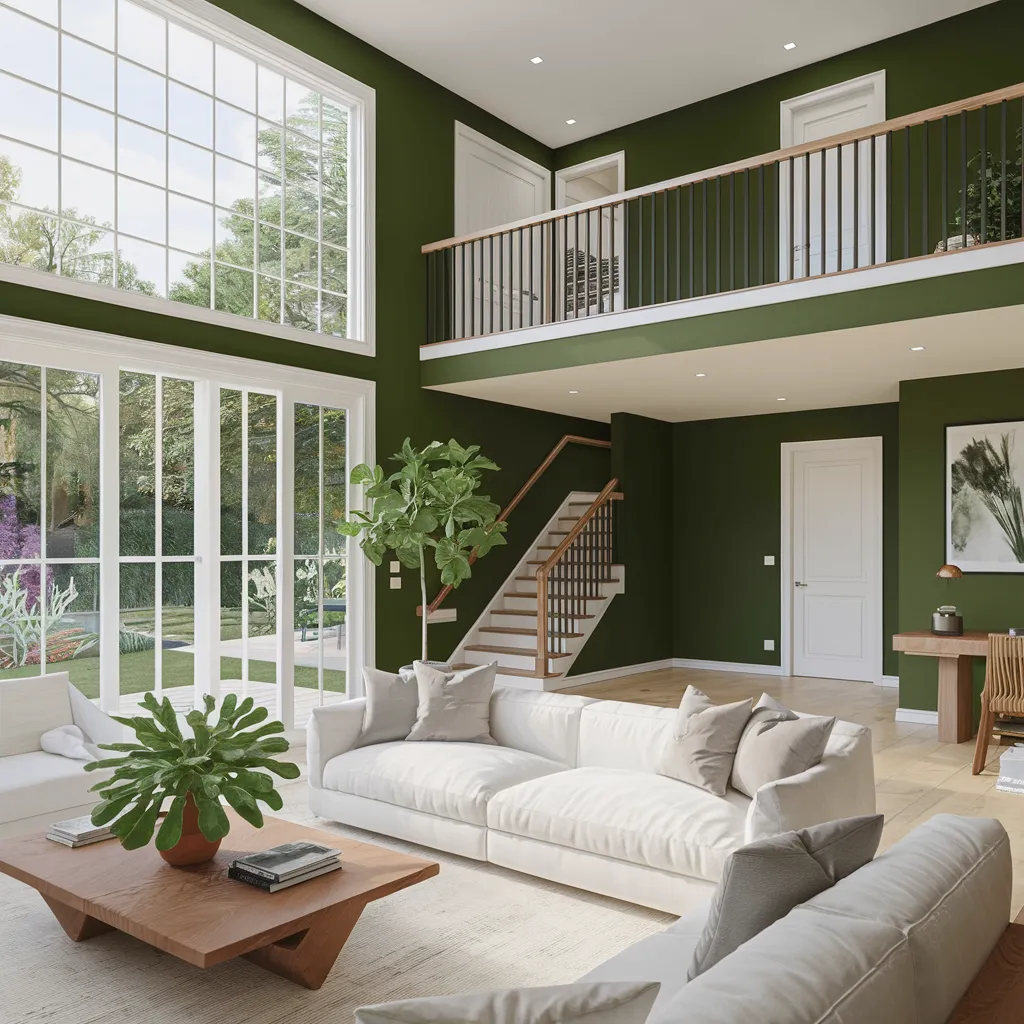
A double-height family room opens to the garden through expansive glazing, with olive walls, white trim, and pale wood underfoot. Low, creamy sofas and minimal decor keep sightlines clear—an easy, contemporary organic style. Palette: forest and olive greens, warm white, light oak, touches of terracotta. The saturated green recedes visually, letting windows and ceiling height read larger, while high-contrast trim, open balustrades, and light floors bounce daylight to amplify spaciousness.
Embracing the Depths: Rich Blues and the Art of Perceived Spaciousness
While conventional wisdom may suggest that deep blues can make a room feel smaller, these rich hues can actually create a sense of depth and spaciousness when used thoughtfully. The key lies in harnessing the natural receding quality of dark blues, allowing them to visually push back the boundaries of a space. By combining deep navy or indigo tones with crisp white elements, such as geometric tiles or architectural details, you can control the contrast and prevent the space from feeling cramped. This strategic interplay of light and dark creates an illusion of expansiveness, inviting the eye to explore the perceived depth. However, it’s essential to strike the right balance, as too much contrast can disrupt the desired effect.
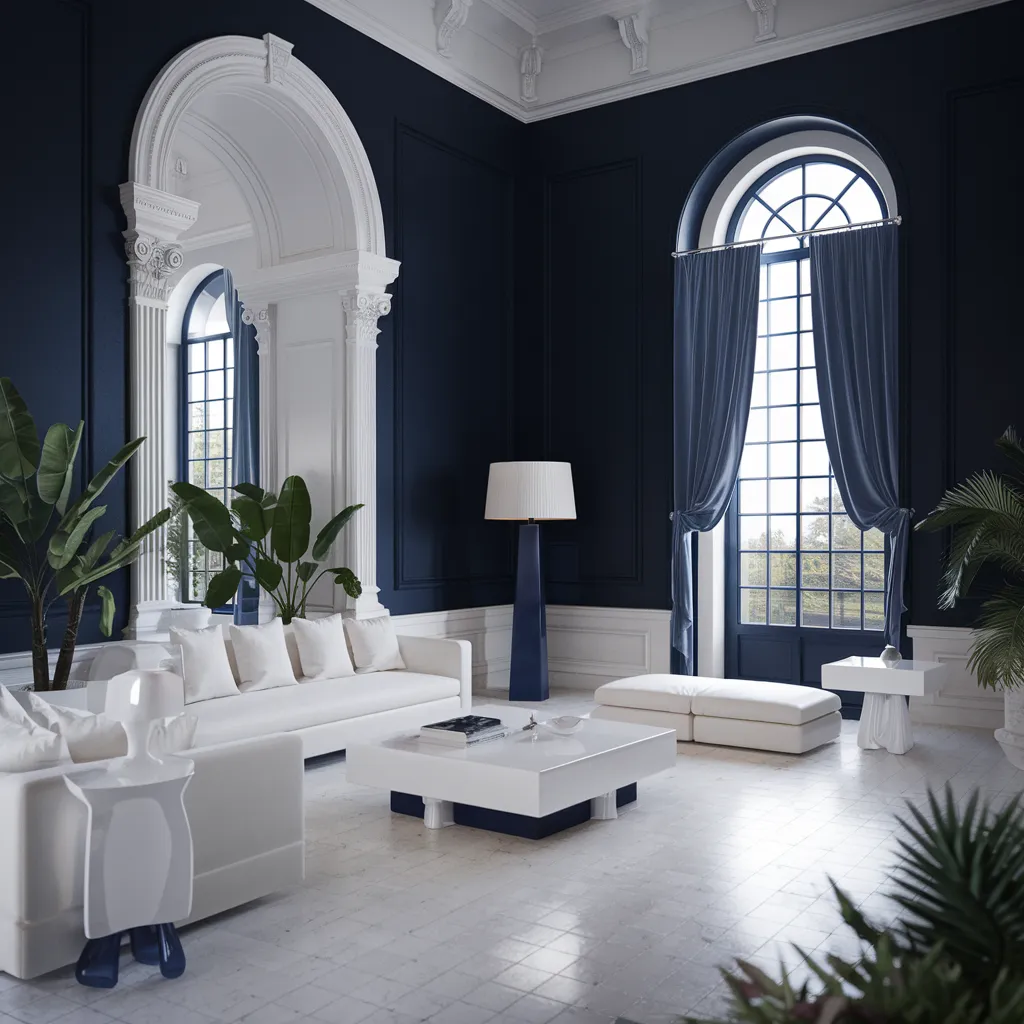
Grand scale meets restraint in this living room wrapped in inky navy paneling and crisp white architectural moldings. Tall arched windows, flowing blue drapery, and streamlined white seating anchor a neoclassical-meets-modern look. Palette: deep navy and midnight blue balanced with bright white, soft gray stone, and leafy greens. The dark envelope pushes the walls outward while reflective pale furnishings and vertical detailing draw the eye up, expanding perceived volume without sacrificing drama.
Seamless Harmony: Unifying Colors for an Expansive Illusion
To truly maximize the illusion of space within your home, consider embracing a seamless color palette that unifies walls, ceilings, and trim. By painting these surfaces in the same pale hue, you eliminate visual interruptions and allow the eye to roam freely, creating a sense of continuous flow. This lack of strong contrast encourages fluid eye movement, blurring the boundaries and enhancing the perceived expansiveness of the space. However, this doesn’t mean sacrificing texture or interest – strategic pops of contrasting color, organic curves, and tactile elements can add depth and dimension without compromising the overall effect. Remember, the color of the walls plays the most significant role in determining spatial perception due to their dominant surface area and ability to set boundaries. But floors, furniture, and accents in stark contrast can also impact the illusion, so choose wisely.
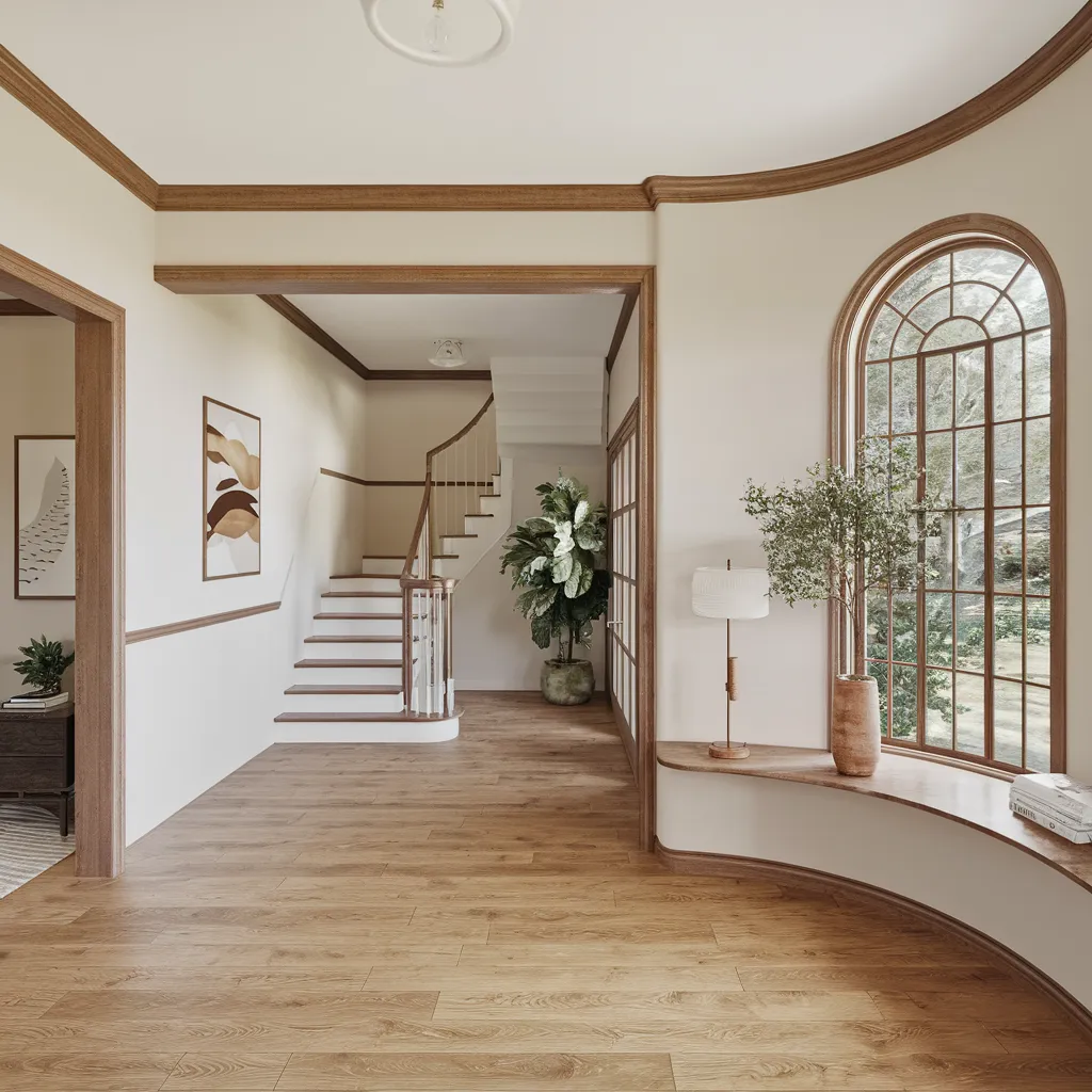
An airy entry pairs creamy off-white walls with continuous oak trim, a curved window seat, and light plank floors that carry the eye toward a simple staircase and leafy greenery. Style: modern traditional/transitional—clean lines softened by classic millwork and arched glazing. Palette: warm whites and pale taupes, honeyed oak, hints of terracotta and fresh green. The low-contrast scheme, broad windows, and uninterrupted wood tone stretch the envelope, making circulation spaces feel wider, brighter, and more fluid.